What other things do you notice about this faceted plot? How does a faceted plot help us see relationships between two variables?
Section 2.6 Facets
Before continuing with the next of the 5NG, let’s briefly introduce a new concept called faceting. Faceting is used when we’d like to split a particular visualization by the values of another variable. This will create multiple copies of the same type of plot with matching x and y axes, but whose content will differ.
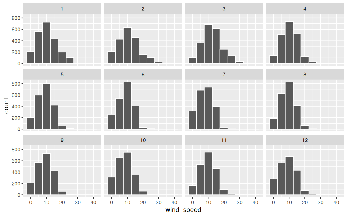
For example, suppose we were interested in looking at how the histogram of hourly wind speed recordings at the three NYC airports we saw in Figure 2.5.2 differed in each month. We could “split” this histogram by the 12 possible months in a given year. In other words, we would plot histograms of
wind_speed for each month separately. We do this by adding facet_wrap(~ month) layer. Note the ~ is a “tilde” and can generally be found on the key next to the “1” key on US keyboards. The tilde is required and you’ll receive the error Error in as.quoted(facets) : object 'month' not found if you don’t include it here.
ggplot(data = weather, mapping = aes(x = wind_speed)) +
  geom_histogram(binwidth = 5, color = "white") +
  facet_wrap(~ month)
We can also specify the number of rows and columns in the grid by using the
nrow and ncol arguments inside of facet_wrap(). For example, say we would like our faceted histogram to have 4 rows instead of 3. We simply add an nrow = 4 argument to facet_wrap(~ month).
ggplot(data = weather, mapping = aes(x = wind_speed)) +
  geom_histogram(binwidth = 5, color = "white") +
  facet_wrap(~ month, nrow = 4)
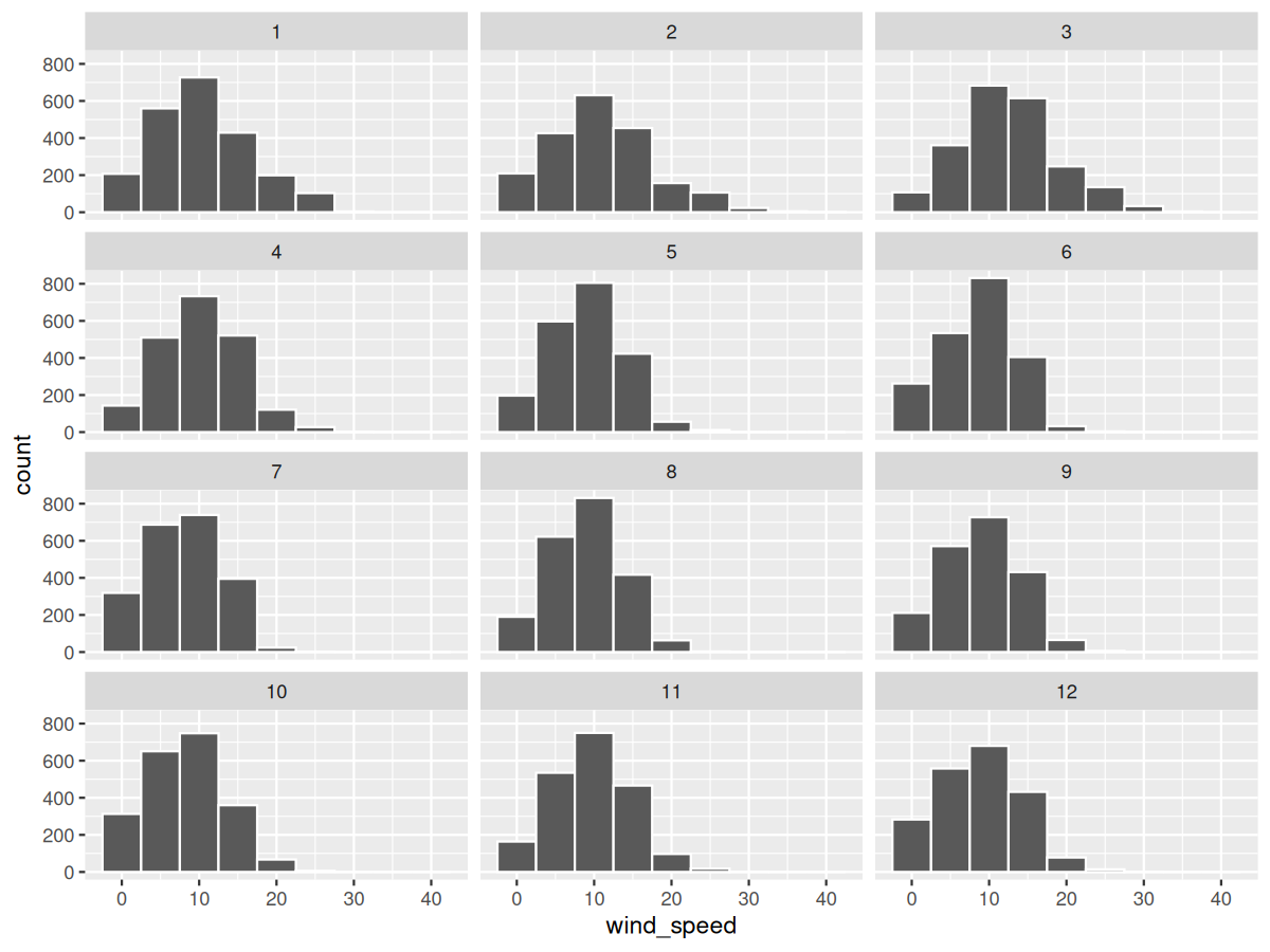
Observe in both Figure 2.6.1 and Figure 2.6.2 the majority of wind speed observations for all months are clustered between 0 and 20 mph, with very few observations exceeding 30 mph. The histograms show a similar shape across months, with most distributions having a similar largest count and a few larger speed outliers, indicating that lower wind speeds are more common than higher wind speeds.
Checkpoint 2.6.3. Learning Check 2.18.
Checkpoint 2.6.4. Learning Check 2.19.
What do the numbers 1–12 correspond to in the plot? What about 10, 20, and 30?
Checkpoint 2.6.5. Learning Check 2.20.
For which types of datasets would faceted plots not work well in comparing relationships between variables? Give an example describing the nature of these variables and other important characteristics.
Checkpoint 2.6.6. Learning Check 2.21.
Does the
wind_speed variable in the weather dataset have a lot of variability? Why do you say that?

