What do the dots at the top of the plot for January correspond to? Explain what might have occurred in January to produce these points.
Section 2.7 5NG#4: Boxplots
While faceted histograms are one type of visualization used to compare the distribution of a numerical variable split by the values of another variable, another type of visualization that achieves this same goal is a side-by-side boxplot. A boxplot is constructed from the information provided in the five-number summary of a numerical variable. To keep things simple for now, let’s only consider the recorded hourly wind speed recordings for the month of April, each represented as a jittered point in Figure 2.7.1.
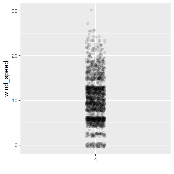
These 2057 observations have the following five-number summary:
-
Minimum: 0mph
-
First quartile (25th percentile): 5.8 mph
-
Median (second quartile, 50th percentile): 9.2 mph
-
Third quartile (75th percentile): 12.7 mph
-
Maximum: 29.92 mph
In Figure 2.7.2, the leftmost plot marks these 5 values with dashed horizontal lines on top of the 2057 points. In the middle plot of Figure 2.7.2 let’s add the boxplot. In the rightmost plot of Figure 2.7.2, let’s remove the points and the dashed horizontal lines for clarity’s sake.
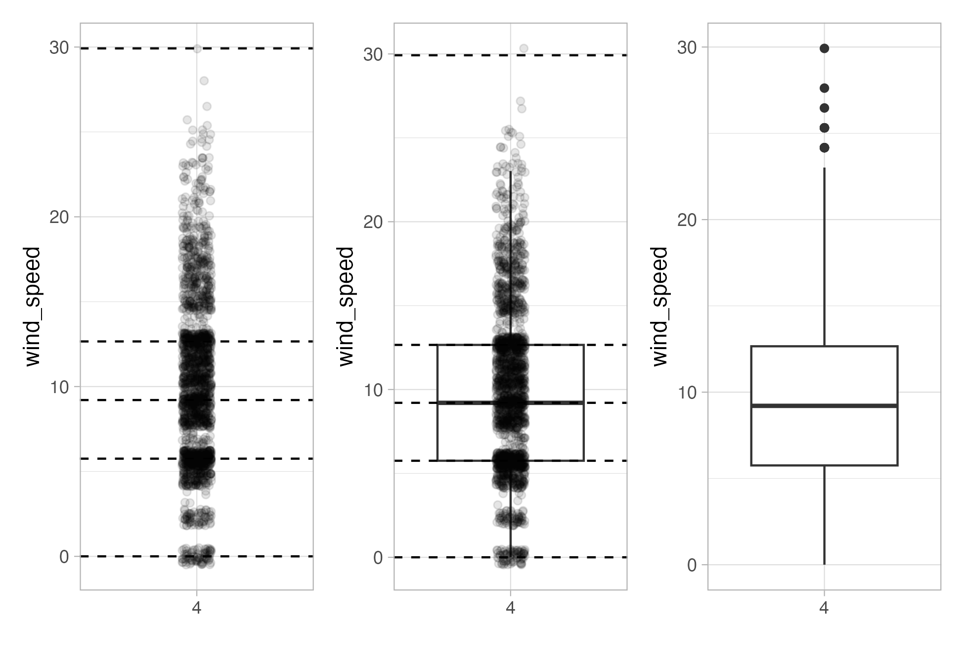
What the boxplot does is visually summarize the 2057 points by cutting the wind speed recordings into quartiles at the dashed lines, where each quartile contains roughly \(2057/4 \approx 514\) an equal number of observations. Thus
-
25% of points fall below the bottom edge of the box, which is the first quartile. In other words, 25% of observations were below the first quartile value.
-
25% of points fall between the bottom edge of the box and the solid middle line, which is the median. Thus, 25% of observations were between the first quartile and the median, and 50% of observations were below the median.
-
25% of points fall between the solid middle line and the top edge of the box, which is the third quartile. It follows that 25% of observations were between the median and the third quartile, and 75% of observations were below the third quartile.
-
25% of points fall above the top edge of the box. In other words, 25% of observations were above the third quartile.
-
The middle 50% of points lie within the interquartile range (IQR) between the first and third quartile. The interquartile range measures a numerical variable’s spread.
Furthermore, in the rightmost plot of Figure 2.7.2, we see the whiskers of the boxplot. The whiskers stick out from either end of the box all the way to the minimum and maximum observed wind speeds of 0 mph and 29.92 mph, respectively. However, the whiskers don’t always extend to the smallest and largest observed values. They in fact extend no more than 1.5 \(\times\) the interquartile range from either end of the box, in this case of the April wind speeds, no more than 1.5 \(\times\) 6.905 mph = 10.357 mph from either end of the box. Any observed values outside this range get marked with points called outliers, which we’ll discuss further in the next section.
Subsection 2.7.1 Boxplots via geom_boxplot
Let’s now create a side-by-side boxplot of hourly wind speeds split by the 12 months as we did previously with the faceted histograms. We do this by mapping the
month variable to the x-position aesthetic, the wind_speed variable to the y-position aesthetic, and by adding a geom_boxplot() layer:
ggplot(data = weather, mapping = aes(x = month, y = wind_speed)) +
  geom_boxplot()
Warning message:
1: Continuous x aesthetic -- did you forget aes(group=...)?
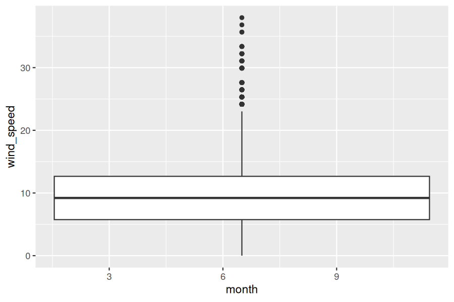
Observe in Figure 2.7.3 that this plot does not provide information about wind speed separated by month. The first warning message tells us why. It says that we have a “continuous” (or numerical variable) on the x-position aesthetic. Boxplots, however, require a categorical variable to be mapped to the x-position aesthetic.
We can convert the numerical variable
month into a factor categorical variable by using the factor() function. After applying factor(month), month goes from having just the numerical values 1, 2, ..., and 12 to having an associated ordering. With this ordering, ggplot() now knows how to work with this variable to produce the plot.
ggplot(data = weather, mapping = aes(x = factor(month), y = wind_speed)) +
  geom_boxplot()
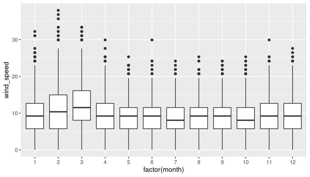
The resulting Figure 2.7.4 shows 12 separate “box and whiskers” plots similar to the rightmost plot of Figure 2.7.2 of only April wind speeds. Thus the different boxplots are shown “side-by-side.”
-
The “box” portions of the visualization represent the 1st quartile, the median (the 2nd quartile), and the 3rd quartile.
-
The height of each box (the value of the 3rd quartile minus the value of the 1st quartile) is the interquartile range (IQR). It is a measure of the spread of the middle 50% of values, with longer boxes indicating more variability.
-
The “whisker” portions of these plots extend out from the bottoms and tops of the boxes and represent points less than the 25th percentile and greater than the 75th percentiles, respectively. They’re set to extend out no more than \(1.5 \times IQR\) units away from either end of the boxes. We say “no more than” because the ends of the whiskers have to correspond to observed wind speeds. The length of these whiskers shows how the data outside the middle 50% of values vary, with longer whiskers indicating more variability.
-
The dots representing values falling outside the whiskers are called outliers. These can be thought of as anomalous (“out-of-the-ordinary”) values.
It is important to keep in mind that the definition of an outlier is somewhat arbitrary and not absolute. In this case, they are defined by the length of the whiskers, which are no more than \(1.5 \times IQR\) units long for each boxplot. Looking at this side-by-side plot we can see that the months of February and March have higher median wind speeds as evidenced by the higher solid lines in the middle of the boxes. We can easily compare wind speeds across months by drawing imaginary horizontal lines across the plot. Furthermore, the heights of the 12 boxes as quantified by the interquartile ranges are informative too; they tell us about variability, or spread, of wind speeds recorded in a given month.
Checkpoint 2.7.5. Learning Check 2.22.
Checkpoint 2.7.6. Learning Check 2.23.
Which months seem to have the highest variability in wind speed? What reasons can you give for this?
Checkpoint 2.7.7. Learning Check 2.24.
We looked at the distribution of the numerical variable
wind_speed split by the numerical variable month that we converted using the factor() function in order to make a side-by-side boxplot. Why would a boxplot of wind_speed split by the numerical variable pressure similarly converted to a categorical variable using the factor() not be informative?
Checkpoint 2.7.8. Learning Check 2.25.
Boxplots provide a simple way to identify outliers. Why may outliers be easier to identify when looking at a boxplot instead of a faceted histogram?
Subsection 2.7.2 Summary
Side-by-side boxplots provide us with a way to compare the distribution of a numerical variable across multiple values of another variable. One can see where the median falls across the different groups by comparing the solid lines in the center of the boxes.
To study the spread of a numerical variable within one of the boxes, look at both the length of the box and also how far the whiskers extend from either end of the box. Outliers are even more easily identified when looking at a boxplot than when looking at a histogram as they are marked with distinct points.

