It is an unfortunate truth that life expectancy is not the same across all countries in the world. International development agencies are interested in studying these differences in life expectancy in the hopes of identifying where governments should allocate resources to address this problem. In this section, we explore differences in life expectancy in two ways:
Differences between continents: Are there significant differences in average life expectancy between the six populated continents of the world: Africa, North America, South America, Asia, Europe, and Oceania?
Differences within continents: How does life expectancy vary within the world’s five continents? For example, is the spread of life expectancy among the countries of Africa larger than the spread of life expectancy among the countries of Asia?
To answer such questions, we use the un_member_states_2024 data frame we saw earlier in this chapter. It is included in the moderndive package and has international development statistics such as life expectancy, GDP per capita, and population for 193 countries for years near 2024. We use this data for basic regression again, but now using an explanatory variable \(x\) that is categorical, as opposed to the numerical explanatory variable model we used in the previous Section 5.1:
When the explanatory variable \(x\) is categorical, the concept of a “best-fitting” regression line is a little different than the one we saw previously in Section 5.1 where the explanatory variable \(x\) was numerical. We study these differences shortly in Subsection 5.2.2, but first we conduct an exploratory data analysis.
The data on the 193 countries can be found in the un_member_states_2024 data frame included in the moderndive package. However, to keep things simple, we select() only the subset of the variables we’ll consider in this chapter and focus only on rows where we have no missing values with na.omit(). We’ll save this data in a new data frame called gapminder2022:
We perform the first common step in an exploratory data analysis: looking at the raw data values. You can do this by using RStudio’s spreadsheet viewer or by using the glimpse() command:
Observe that Rows: 188 indicates there are 188 rows/observations in gapminder2022, where each row corresponds to one country. In other words, the observational unit is an individual country. Furthermore, observe that the variable continent is of type <fct>, which stands for factor, which is R’s way of encoding categorical variables.
A full description of all the variables included in un_member_states_2024 can be found by reading the associated help file (run ?un_member_states_2024 in the console). However, we fully describe only the 4 variables we selected in gapminder2022:
continent: A categorical variable with five levels. Here “levels” correspond to the possible categories: Africa, Asia, Americas, Europe, and Oceania. This is the explanatory variable \(x\) of interest.
gdp_per_capita: A numerical variable of that country’s GDP per capita in US inflation-adjusted dollars that we’ll use as another outcome variable \(y\) in the Learning check at the end of this subsection.
Random sampling will likely produce a different subset of 3 rows for you than what’s shown. Now that we have looked at the raw values in our gapminder2022 data frame and got a sense of the data, we compute summary statistics. We again apply tidy_summary() from the moderndive package. We take our gapminder2022 data frame, select() only the outcome and explanatory variables life_exp and continent, and pipe them into tidy_summary() in Table 5.2.2:
The tidy_summary() output now reports summaries for categorical variables and for the numerical variables we reviewed before. Let’s focus just on discussing the results for the categorical factor variable continent:
group: Breaks down a categorical variable into its unique levels. For this variable, it corresponds to Africa, Asia, North and South America, Europe, and Oceania.
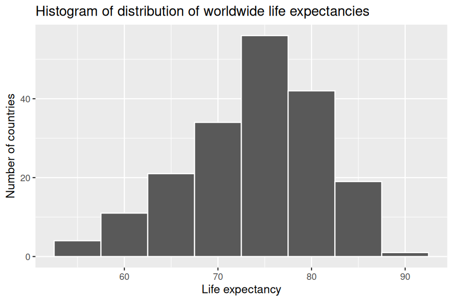
Turning our attention to the summary statistics of the numerical variable life_exp, we observe that the global median life expectancy in 2022 was 75.14. Thus, half of the world’s countries (96 countries) had a life expectancy of less than 75.14. The mean life expectancy of 73.55 is lower, however. Why is the mean life expectancy lower than the median?
We can answer this question by performing the last of the three common steps in an exploratory data analysis: creating data visualizations. We visualize the distribution of our outcome variable \(y\) = life_exp in Figure 5.2.3:
ggplot(gapminder2022, aes(x = life_exp)) +
  geom_histogram(binwidth = 5, color = "white") +
  labs(x = "Life expectancy",
       y = "Number of countries",
       title = "Histogram of distribution of worldwide life expectancies")
We see that this data is left-skewed, also known as negatively skewed: there are a few countries with low life expectancy that are bringing down the mean life expectancy. However, the median is less sensitive to the effects of such outliers; hence, the median is greater than the mean in this case.
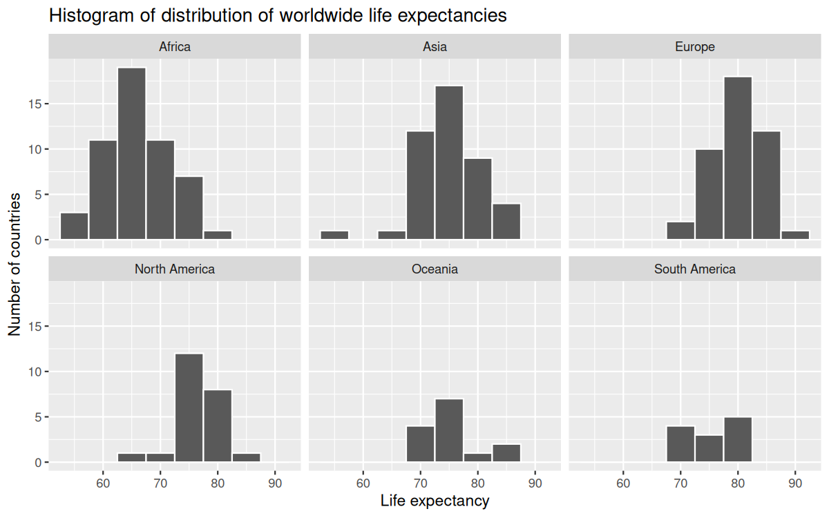
Remember, however, that we want to compare life expectancies both between continents and within continents. In other words, our visualizations need to incorporate some notion of the variable continent. We can do this easily with a faceted histogram. Recall that facets allow us to split a visualization by the different values of another variable. We display the resulting visualization by adding a facet_wrap(~ continent, nrow = 2) layer.
ggplot(gapminder2022, aes(x = life_exp)) +
  geom_histogram(binwidth = 5, color = "white") +
  labs(x = "Life expectancy",
       y = "Number of countries",
       title = "Histogram of distribution of worldwide life expectancies") +
  facet_wrap(~ continent, nrow = 2)
Figure5.2.4.Life expectancy in 2022 by continent (faceted).
Observe that unfortunately the distribution of African life expectancies is much lower than the other continents. In Europe, life expectancies tend to be higher and furthermore do not vary as much. On the other hand, both Asia and Africa have the most variation in life expectancies.
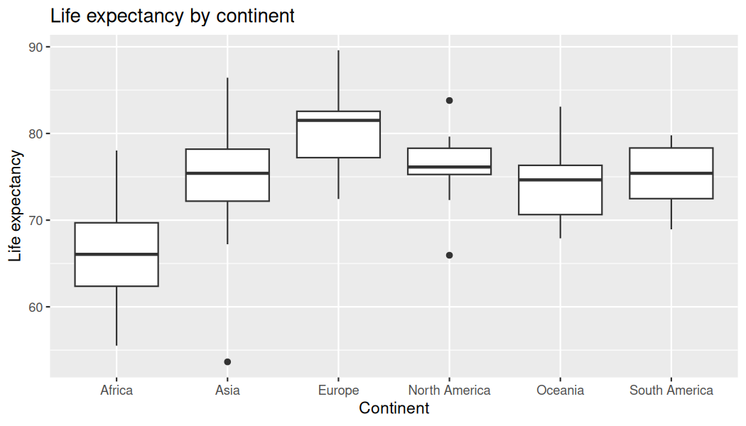
Recall that an alternative method to visualize the distribution of a numerical variable split by a categorical variable is by using a side-by-side boxplot. We map the categorical variable continent to the \(x\)-axis and the different life expectancies within each continent on the \(y\)-axis in Figure 5.2.5:
Some people prefer comparing the distributions of a numerical variable between different levels of a categorical variable using a boxplot instead of a faceted histogram. This is because we can make quick comparisons between the categorical variable’s levels with imaginary horizontal lines. For example, observe in Figure 5.2.5 that we can quickly convince ourselves that Europe has the highest median life expectancies by drawing an imaginary horizontal line near \(y = 81\text{.}\) Furthermore, as we observed in the faceted histogram in Figure 5.2.4, Africa and Asia have the largest variation in life expectancy as evidenced by their large interquartile ranges (the size of the boxes).
It’s important to remember, however, that the solid lines in the middle of the boxes correspond to the medians (the middle value) rather than the mean (the average). So, for example, if you look at Asia, the solid line denotes the median life expectancy of around 75 years. This tells us that half of all countries in Asia have a life expectancy below 75 years, whereas half have a life expectancy above 75 years. We compute the median and mean life expectancy for each continent with a little more data wrangling and display the results in Table 5.2.6
bserve the order of the second column median life expectancy: Africa is lowest, Europe the highest, and the others have similar medians between Africa and Europe. This ordering corresponds to the ordering of the solid black lines inside the boxes in our side-by-side boxplot in Figure 5.2.5.
We now turn our attention to the values in the third column mean. Using Africa’s mean life expectancy of 66.31 as a baseline for comparison, we start making comparisons to the mean life expectancies of the other four continents and put these values in Table 5.2.7, which we’ll revisit later on in this section.
Conduct a new exploratory data analysis with the same explanatory variable \(x\) being continent but with gdp_per_capita as the new outcome variable \(y\text{.}\) What can you say about the differences in GDP per capita between continents based on this exploration?
B. The baseline is the reference category against which others are compared (it’s not necessarily largest/smallest by any statistic unless you set it).
In Subsection 5.1.2 we introduced simple linear regression, which involves modeling the relationship between a numerical outcome variable \(y\) and a numerical explanatory variable \(x\text{.}\) In our life expectancy example, we now instead have a categorical explanatory variable continent. Our model will not yield a “best-fitting” regression line like in Figure 5.1.3, but rather offsets relative to a baseline for comparison.
As we did in Subsection 5.1.2 when studying the relationship between fertility rates and life expectancy, we output the regression coefficients for this model. Recall that this is done in two steps:
continentAsia corresponds to countries in Asia and the value +8.64 is the difference in mean life expectancy relative to Africa we displayed in Table 5.2.6. In other words, the mean life expectancy of countries in Asia is \(66.31 + 8.64 = 74.95\text{.}\)
continentEurope corresponds to countries in Europe and the value +13.6 is the difference in mean life expectancy relative to Africa we displayed in Table 5.2.6. In other words, the mean life expectancy of countries in Europe is \(66.31 + 13.6 = 79.91\text{.}\)
continentNorth America corresponds to countries in North America and the value +9.98 is the difference in mean life expectancy relative to Africa we displayed in Table 5.2.6. In other words, the mean life expectancy of countries in North America is \(66.31 + 9.98 = 76.29\text{.}\)
continentOceania corresponds to countries in Oceania and the value +8.11 is the difference in mean life expectancy relative to Africa we displayed in Table 5.2.6. In other words, the mean life expectancy of countries in Oceania is \(66.31 + 8.11 = 74.42\text{.}\)
continentSouth America corresponds to countries in South America and the value +8.92 is the difference in mean life expectancy relative to Africa we displayed in Table 5.2.6. In other words, the mean life expectancy of countries in South America is \(66.31 + 8.92 = 75.23\text{.}\)
To summarize, the 6 values for the regression coefficients correspond to the “baseline for comparison” continent Africa (the intercept) as well as five “offsets” from this baseline for the remaining 5 continents: Asia, Europe, North America, Oceania, and South America.
You might be asking at this point why was Africa chosen as the “baseline for comparison” group. This is the case for no other reason than it comes first alphabetically of the six continents; by default R arranges factors/categorical variables in alphanumeric order. You can change this baseline group to be another continent if you manipulate the variable continent’s factor “levels” using the forcats package. See Chapter 15 of R for Data Science[1] for examples.
Whoa! That looks daunting! Don’t fret, however, as once you understand what all the elements mean, things simplify greatly. First, \(\mathbb{1}_{A}(x)\) is what’s known in mathematics as an “indicator function.” It returns only one of two possible values, 0 and 1, where
\begin{equation*}
\mathbb{1}_{A}(x) = \begin{cases} 1 \amp \text{if } x \text{ is in } A \\ 0 \amp \text{otherwise} \end{cases}
\end{equation*}
In a statistical modeling context, this is also known as a dummy variable. In our case, we consider the first such indicator variable \(\mathbb{1}_{\text{Asia}}(x)\text{.}\) This indicator function returns 1 if a country is in Asia, 0 otherwise:
\begin{equation*}
\mathbb{1}_{\text{Asia}}(x) = \begin{cases} 1 \amp \text{if country } x \text{ is in Asia} \\ 0 \amp \text{otherwise} \end{cases}
\end{equation*}
Second, \(b_0\) corresponds to the intercept as before; in this case, it is the mean life expectancy of all countries in Africa. Third, the \(b_{\text{Asia}}\text{,}\)\(b_{\text{Europe}}\text{,}\)\(b_{\text{North America}}\text{,}\)\(b_{\text{Oceania}}\text{,}\) and \(b_{\text{South America}}\) represent the 5 “offsets relative to the baseline for comparison” in the regression coefficients.
We put this all together and compute the fitted value \(\widehat{y} = \widehat{\text{life exp}}\) for a country in Africa. Since the country is in Africa, all five indicator functions \(\mathbb{1}_{\text{Asia}}(x)\text{,}\)\(\mathbb{1}_{\text{Europe}}(x)\text{,}\)\(\mathbb{1}_{\text{North America}}(x)\text{,}\)\(\mathbb{1}_{\text{Oceania}}(x)\text{,}\) and \(\mathbb{1}_{\text{South America}}(x)\) will equal 0, and thus:
In other words, all that is left is the intercept \(b_0\text{,}\) corresponding to the average life expectancy of African countries of 66.31 years. Next, say we are considering a country in Asia. In this case, only the indicator function \(\mathbf{1}_{\text{Asia}}(x)\) for Asia will equal 1, while all the others will equal 0, and thus:
which is the mean life expectancy for countries in Asia of 74.95 years in Table 5.2.7. Note the “offset from the baseline for comparison” is +8.64 years.
We do one more. Say we are considering a country in South America. In this case, only the indicator function \(\mathbf{1}_{\text{South America}}(x)\) for South America will equal 1, while all the others will equal 0, and thus:
which is the mean life expectancy for South American countries of 75.23 years in Table 5.2.7. The “offset from the baseline for comparison” here is +8.64 years.
We generalize this idea a bit. If we fit a linear regression model using a categorical explanatory variable \(x\) that has \(k\) possible categories, the regression table will return an intercept and \(k - 1\) “offsets.” In our case, since there are \(k = 6\) continents, the regression model returns an intercept corresponding to the baseline for comparison group of Africa and \(k - 1 = 5\) offsets corresponding to Asia, Europe, North America, Oceania, and South America.
Understanding a regression table output when you are using a categorical explanatory variable is a topic those new to regression often struggle with. The only real remedy for these struggles is practice, practice, practice. However, once you equip yourselves with an understanding of how to create regression models using categorical explanatory variables, you’ll be able to incorporate many new variables into your models, given the large amount of the world’s data that is categorical.
Fit a linear regression using lm(gdp_per_capita ~ continent, data = gapminder2022) where gdp_per_capita is the new outcome variable. Get information about the “best-fitting” line from the regression coefficients. How do the regression results match up with the results from your previous exploratory data analysis?
The intercept is the baseline continent’s mean GDP per capita. Each continent coefficient is an offset from the baseline mean. Signs/magnitudes should mirror your boxplot: positive for richer-than-baseline continents, negative for poorer-than-baseline.
We obtained these values and other values using the get_regression_points() function from the moderndive package. This time, however, we add an argument setting ID = "country", which uses the variable country in gapminder2022 as an identification variable in the output. This will help contextualize our analysis by matching values to countries.
Observe in Table 5.2.8 that life_exp_hat contains the fitted values \(\widehat{y} = \widehat{\text{life exp}}\text{.}\) If you look closely, there are only 5 possible values for life_exp_hat. These correspond to the five mean life expectancies for the 5 continents that we displayed in Table 5.2.7 and computed using the regression coefficient values.
The residual column is simply \(y - \widehat{y}\) = life_exp - life_exp_hat. These values can be interpreted as the deviation of a country’s life expectancy from its continent’s average life expectancy. For example, observe the first row of Table 5.2.8 corresponding to Afghanistan. The residual of \(y - \hat{y} = 53.6 - 74.95 = -21.4\) refers to Afghanistan’s life expectancy being 21.4 years lower than the mean life expectancy of all Asian countries. This is partly explained by the years of war that country has suffered.
Using either the sorting functionality of RStudio’s spreadsheet viewer or using the data wrangling tools you learned in the wrangling chapter, identify the five countries with the five smallest (most negative) residuals? What do these negative residuals say about their life expectancy relative to their continents’ life expectancy?
life_exp_model <- lm(life_exp ~ continent, data = gapminder2022)

rp <- get_regression_points(life_exp_model, ID = "country")

rp |>

  arrange(residual) |>

  slice(1:5) |>

  select(country, continent, life_exp, life_exp_hat, residual)
# A tibble: 187 × 5
   country             life_exp continent     life_exp_hat residual
   <chr>                  <dbl> <fct>                <dbl>    <dbl>
 1 Afghanistan             53.6 Asia                  75.0  -21.3
 2 Albania                 79.5 Europe                79.7   -0.207
 3 Algeria                 78.0 Africa                66.3   11.7
 4 Andorra                 83.4 Europe                79.7    3.74
 5 Angola                  62.1 Africa                66.3   -4.2
 6 Antigua and Barbuda     77.8 North America         76.3    1.50
 7 Argentina               78.3 South America         75.2    3.08
 8 Armenia                 76.1 Asia                  75.0    1.18
 9 Australia               83.1 Oceania               74.4    8.67
10 Austria                 82.3 Europe                79.7    2.59
# ℹ 177 more rows
Negative residuals are below their continent’s mean. Their life expectancy is lower than their continent’s average by the residual magnitude in years.
Repeat this process, but identify the five countries with the five largest (most positive) residuals. What do these positive residuals say about their life expectancy relative to their continents’ life expectancy?