Section 7.1 First activity: red balls

Subsection 7.1.1 The proportion of red balls in the bowl

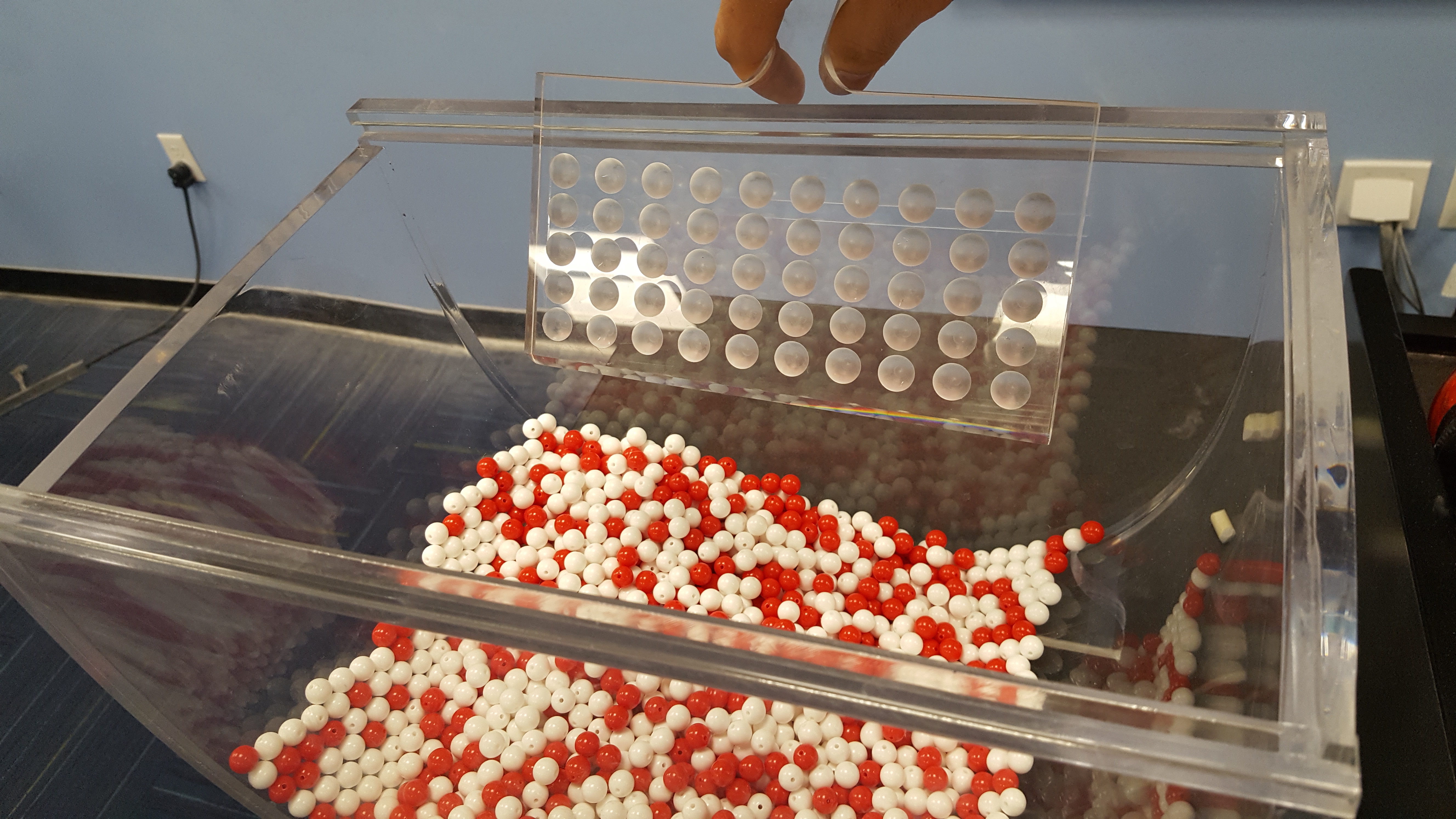
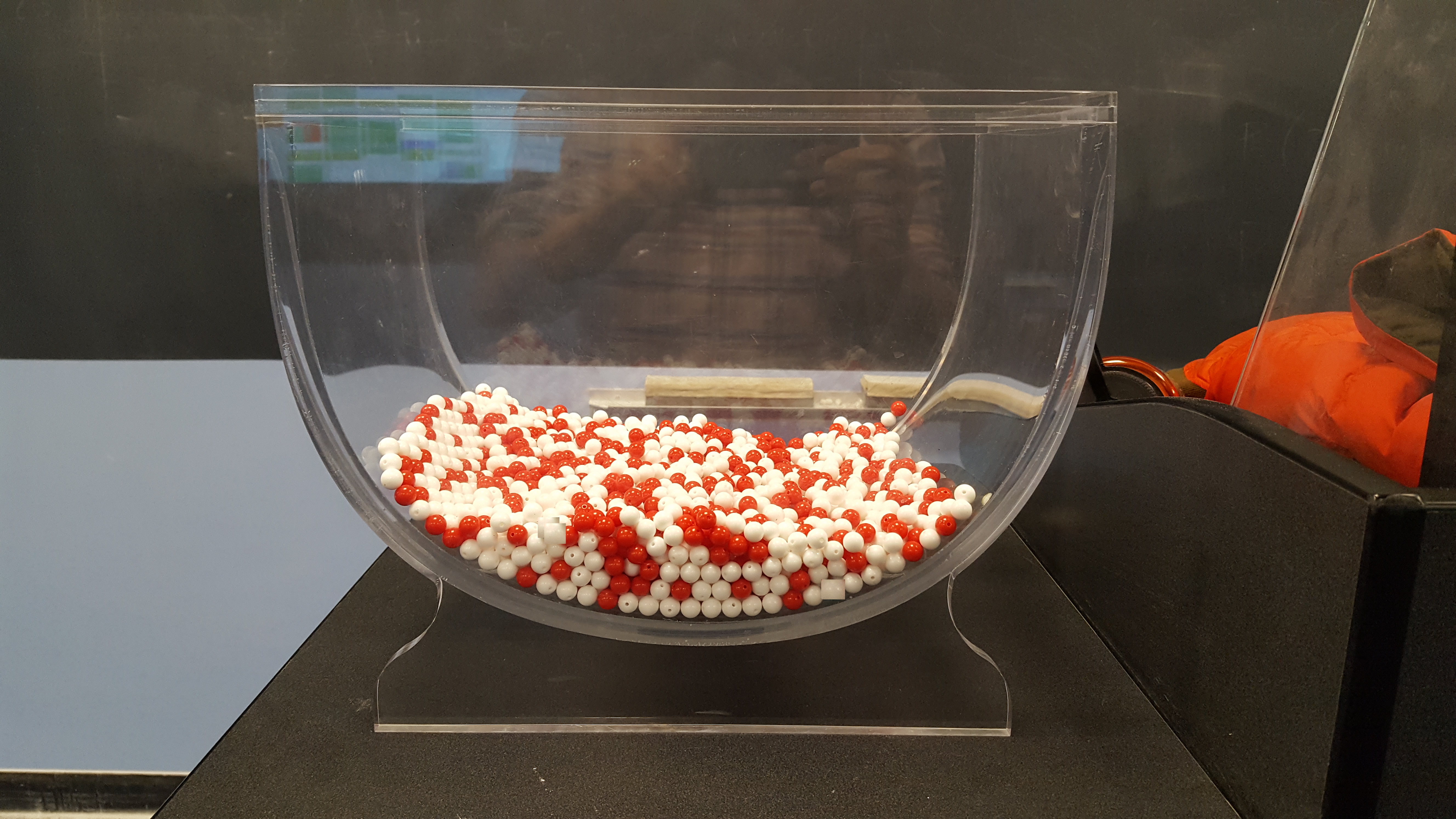
Imagine you have a large bowl filled with red and white balls, as shown in FigureΒ 7.1.1. The bowl contains a mix of colors and you want to know what proportion of the balls are red.
A large bowl containing a mixture of red and white balls.
Figure 7.1.1. A bowl with red and white balls.
The bowl has 2400 rows representing the 2400 balls in the bowl shown in FigureΒ 7.1.1. You can view and scroll through the entire contents of the bowl in RStudio’s data viewer by running View(bowl). The first variable ball_ID is used as an identification variable; none of the balls in the actual bowl are marked with numbers. The second variable color indicates whether a particular virtual ball is red or white.
bowl
# A tibble: 2,400 Γ— 2
   ball_ID color
     <int> <chr>
 1       1 white
 2       2 white
 3       3 white
 4       4 red  
 5       5 white
 6       6 white
 7       7 red  
 8       8 white
 9       9 red  
10      10 white
# β„Ή 2,390 more rows
To compute the proportion of red balls, we can first create an indicator variable that is TRUE if a ball is red and FALSE otherwise. The variable is_red returns the Boolean (logical) value TRUE for each row where color == "red" and FALSE for every row where color is not equal to "red". Since R treats TRUE like the number 1 and FALSE like the number 0, accounting for TRUEs and FALSEs is equivalent to working with 1’s and 0’s. In particular, adding all the 1’s and 0’s is equivalent to counting how many red balls are in the bowl.
bowl |>
  mutate(is_red = (color == "red"))
# A tibble: 2,400 Γ— 3
   ball_ID color is_red
     <int> <chr> <lgl> 
 1       1 white FALSE 
 2       2 white FALSE 
 3       3 white FALSE 
 4       4 red   TRUE  
 5       5 white FALSE 
 6       6 white FALSE 
 7       7 red   TRUE  
 8       8 white FALSE 
 9       9 red   TRUE  
10      10 white FALSE 
# β„Ή 2,390 more rows
We compute this using the sum() function inside the summarize() function. Recall from Section on summarize() that summarize() takes a data frame with many rows and returns a data frame with a single row containing summary statistics such as the sum():
bowl |>
  mutate(is_red = (color == "red")) |>
  summarize(num_red = sum(is_red))
# A tibble: 1 Γ— 1
  num_red
    <int>
1     900
The sum() has added all the 1’s and 0’s and has effectively counted the number of red balls. There are 900 red balls in the bowl. Since the bowl contains 2400 balls, the proportion of red balls is 900/2400 = 0.375. We could ask R to find the proportion directly by replacing the sum() for the mean() function inside summarize(). The average of 1’s and 0’s is precisely the proportion of red balls in the bowl:
bowl |>
  mutate(is_red = (color == "red")) |>
  summarize(prop_red = mean(is_red))
# A tibble: 1 Γ— 1
  prop_red
     <dbl>
1    0.375
This code works well but can be simplified once more. Instead of creating a new Boolean variable is_red before finding the proportion, we could write both steps simultaneously in a single line of code:
bowl |>
  summarize(prop_red = mean(color == "red"))
# A tibble: 1 Γ— 1
  prop_red
     <dbl>
1    0.375
This type of calculation will be used often in the next subsections.

Subsection 7.1.2 Manual sampling

In the previous subsection we were able to find the proportion of red balls in the bowl using R only because we had the information of the entire bowl as a data frame. Otherwise, we would have to retrieve this manually. If the bowl contained a large number of balls, this could be a long and tedious process. How long do you think it would take to do this manually if the bowl had tens of thousands of balls? Or millions? Or even more?
In real-life situations, we are often interested in finding the proportion of a very large number of objects, or subjects, and performing an exhaustive count could be tedious, costly, impractical, or even impossible. Because of these limitations, we typically do not perform exhaustive counts. Rather, for this balls example, we randomly select a sample of balls from the bowl, find the proportion of red balls in this sample, and use this proportion to learn more about the proportion of red balls in the entire bowl.

Subsubsection 7.1.2.1 One sample

A shovel being inserted into a bowl of red and white balls.
Figure 7.1.2. Inserting a shovel into the bowl.
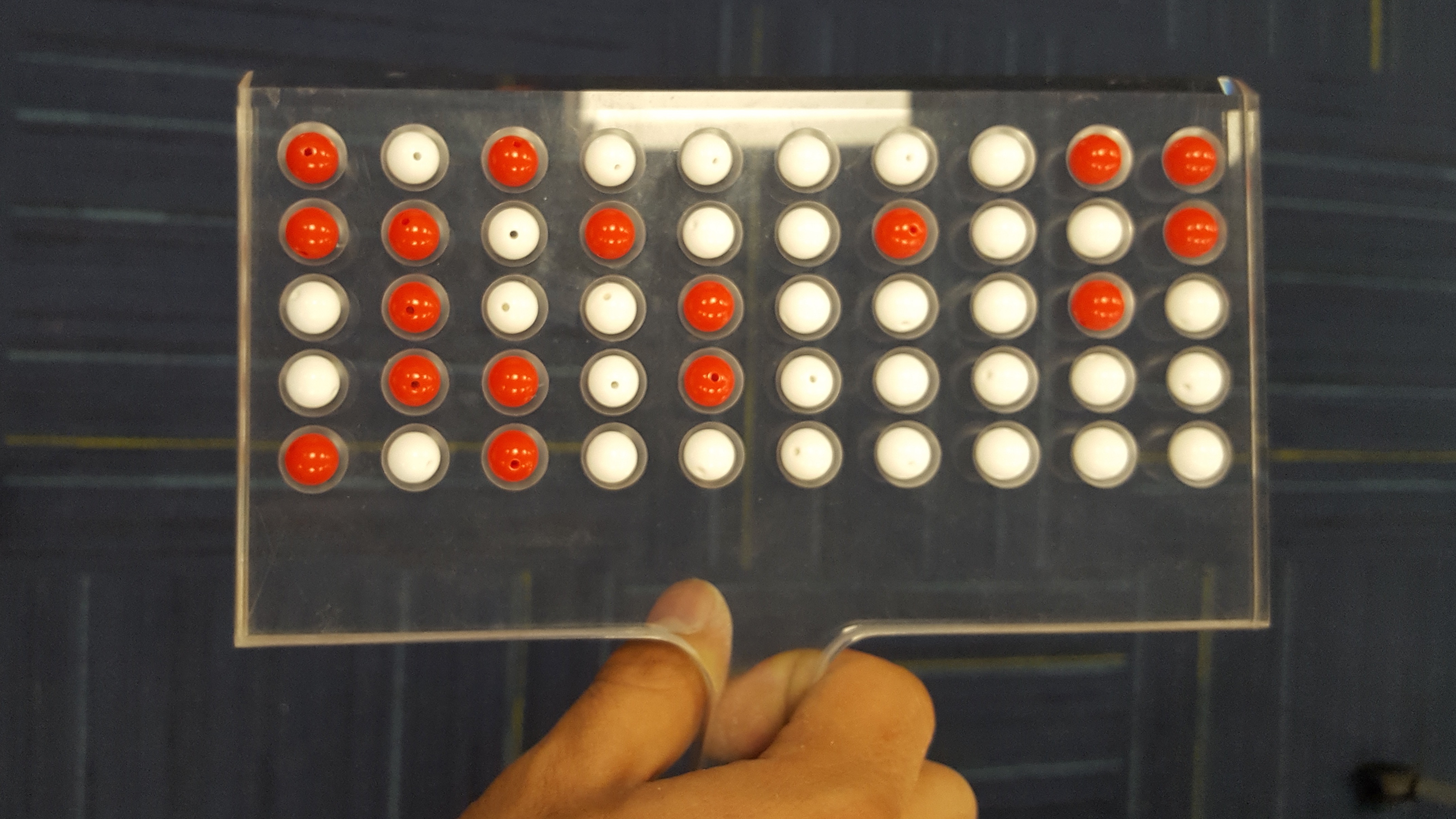
A shovel holding a sample of 50 balls extracted from the bowl.
Figure 7.1.3. Taking a sample of 50 balls from the bowl.
We start by inserting a shovel into the bowl as seen in FigureΒ 7.1.2 and collect \(5 \cdot 10 = 50\) balls as shown in FigureΒ 7.1.3. The set of balls retrieved is called a sample.
Observe that 17 of the balls are red, and thus the proportion of red balls in the sample is 17/50 = 0.34 or 34%. Compare this to the proportion of red balls in the entire bowl, 0.375, that we found in SubsectionΒ 7.1.1. The proportion from the sample seems actually pretty good, and it did not take much time or energy to get. But, was this approximate proportion just a lucky outcome? Could we be this lucky the next time we take a sample from the bowl? Next we take more samples from the bowl and calculate the proportions of red balls.

Subsubsection 7.1.2.2 Thirty-three samples

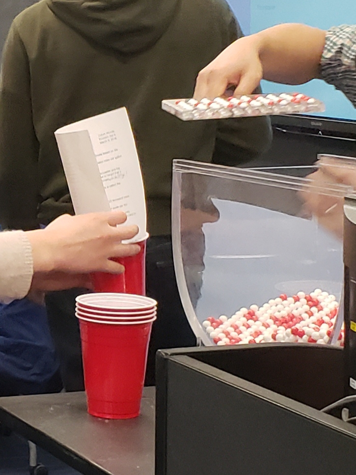
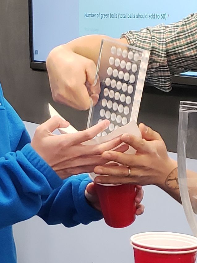
We now take many more random samples as shown in FigureΒ 7.1.4. Each time we do the following:
  • Return the 50 balls used earlier back into the bowl and mix the contents of the bowl to ensure that each new sample is not influenced by the previous sample.
  • Take a new sample with the shovel and determine a new proportion of red balls.
Students taking samples from the bowl.
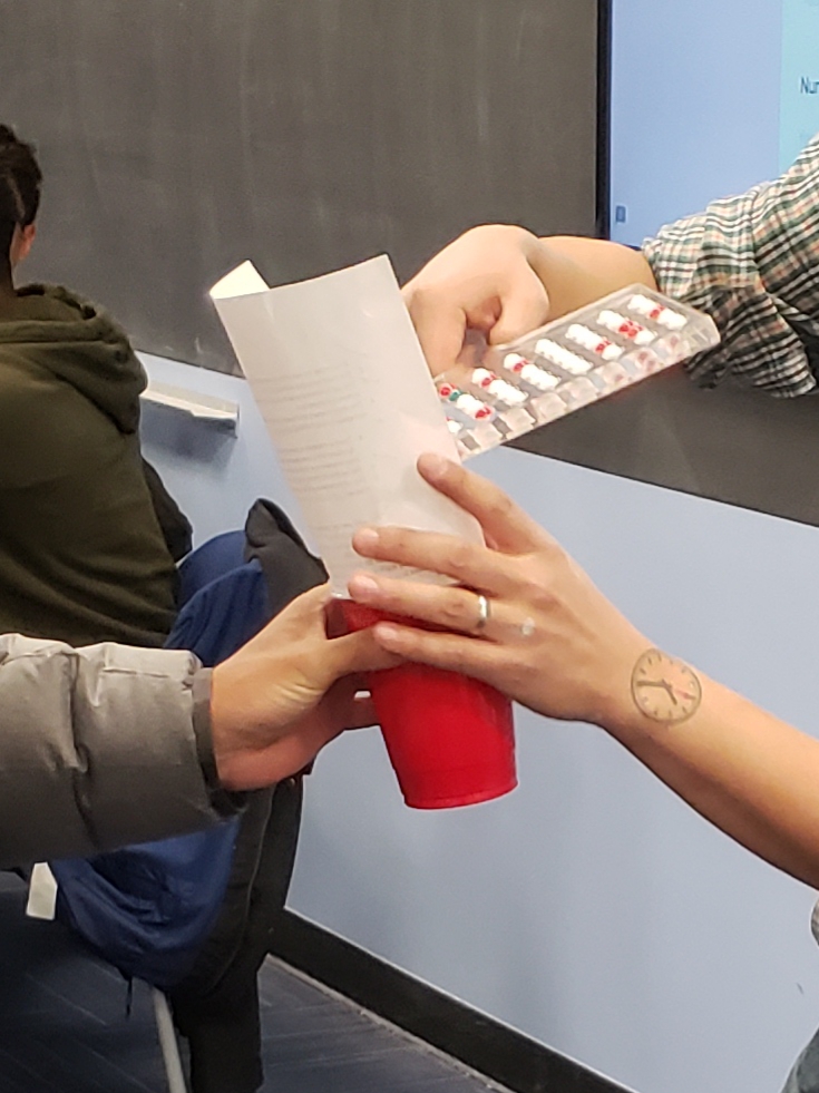
Students recording the number of red balls in their sample.
Students completing their sampling worksheet.
Figure 7.1.4. Repeating the sampling activity.
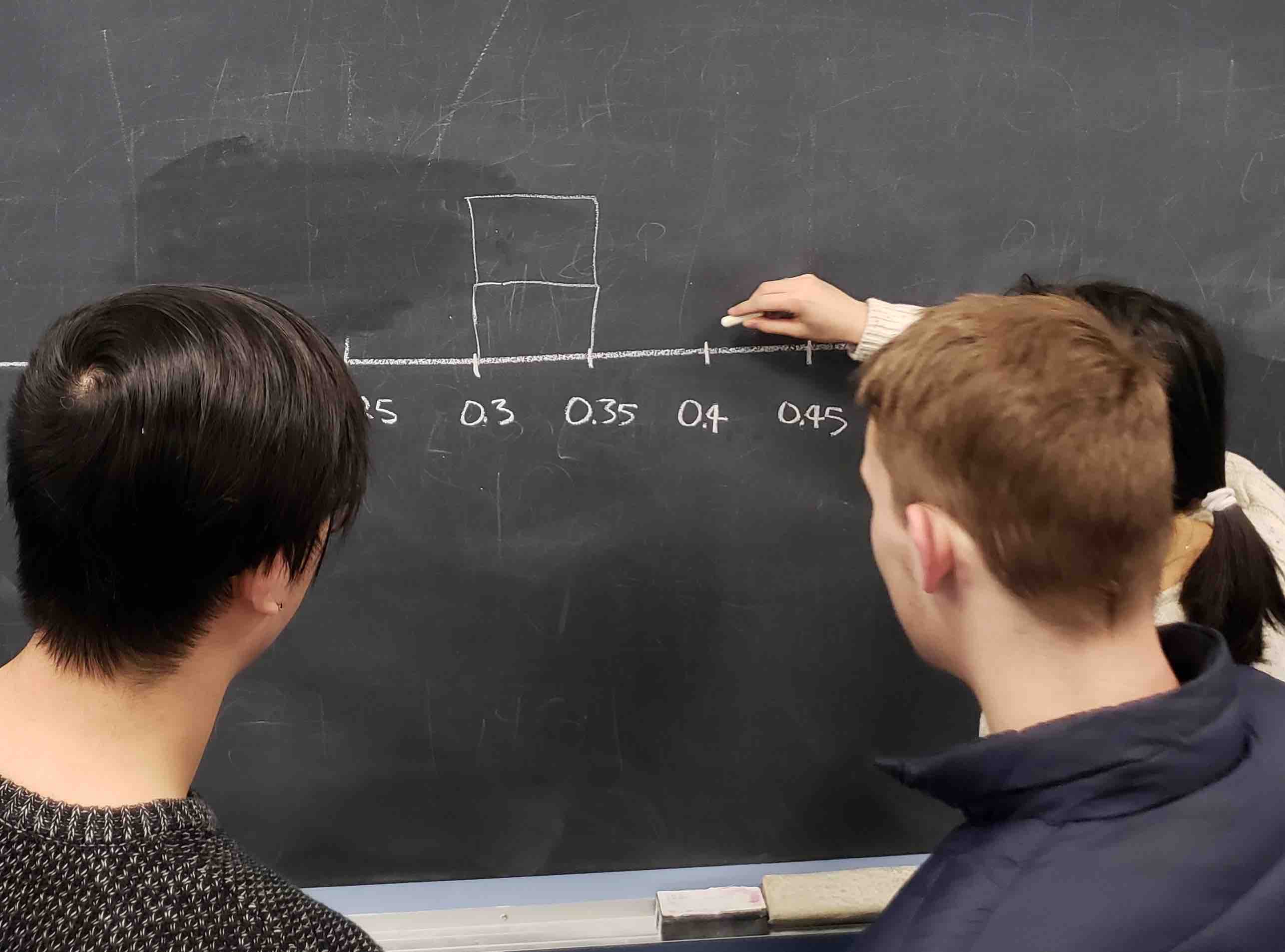
When we perform this activity many times, we observe that different samples may produce different proportions of red balls. A proportion of red balls from a sample is called a sample proportion. A group of 33 students performed this activity previously and drew a histogram using blocks to represent sample proportions of red balls. FigureΒ 7.1.5 shows students working on the histogram with two blocks drawn already representing the first two sample proportions found and the third about to be added.
Students drawing a histogram of their sample proportions on a whiteboard.
Figure 7.1.5. Students drawing a histogram of sample proportions.
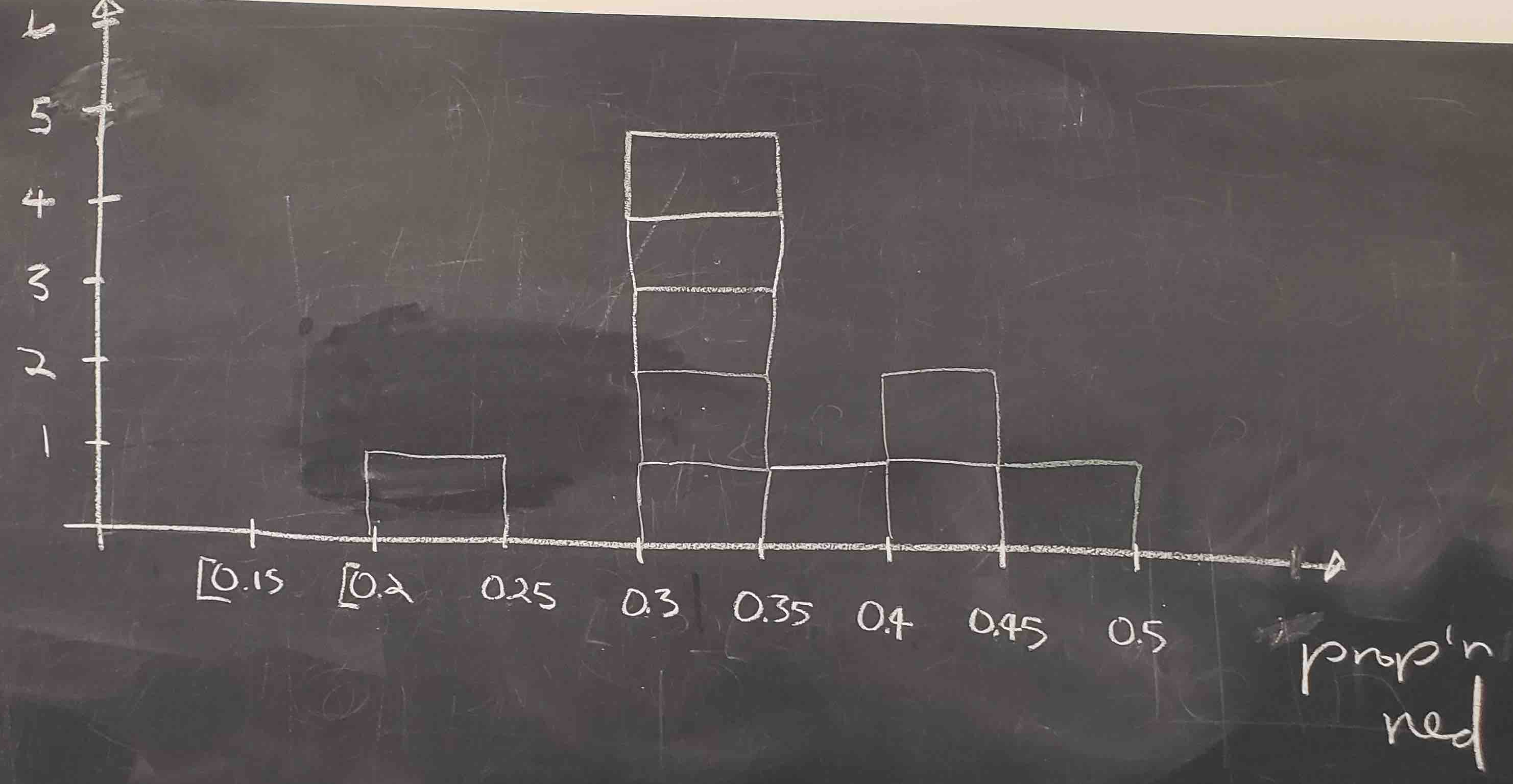
Recall from Section on histograms that histograms help us visualize the distribution of a numerical variable. In particular, where the center of the values falls and how the values vary. A histogram of the first 10 sample proportions can be seen in FigureΒ 7.1.6.
A hand-drawn histogram showing the distribution of 10 sample proportions of red balls.
Figure 7.1.6. Hand-drawn histogram of 10 sample proportions.
By looking at the histogram, we observe that the lowest proportion of red balls was between 0.20 and 0.25 while the highest was between 0.45 and 0.5. More importantly, the most frequently occurring proportions were between 0.30 and 0.35.
This activity performed by 33 students has the results stored in the tactile_prop_red data frame included in the moderndive package. The first 10 rows are given:
tactile_prop_red
# A tibble: 33 Γ— 4
   group            replicate red_balls prop_red
   <chr>                <int>     <int>    <dbl>
 1 Ilyas, Yohan             1        21     0.42
 2 Morgan, Terrance         2        17     0.34
 3 Martin, Thomas           3        21     0.42
 4 Clark, Frank             4        21     0.42
 5 Riddhi, Karina           5        18     0.36
 6 Andrew, Tyler            6        19     0.38
 7 Julia                    7        19     0.38
 8 Rachel, Lauren           8        11     0.22
 9 Daniel, Caroline         9        15     0.3 
10 Josh, Maeve             10        17     0.34
# β„Ή 23 more rows
Observe that for each student group the data frame provides their names, the number of red_balls observed in the sample, and the calculated proportion of red balls in the sample, prop_red. We also have a replicate variable enumerating each of the 33 groups. We chose this name because each row can be viewed as one instance of a replicated (in other words "repeated") activity.
Using again the R data visualization techniques introduced earlier, we construct the histogram for all 33 sample proportions as shown in FigureΒ 7.1.7. Recall that each student has a sample of 50 balls using the same procedure and has calculated the proportion of red balls in each sample. The histogram is built using only those sample proportions. We do not need the individual information of each student or the number of red balls found. We constructed the histogram using ggplot() with geom_histogram(). To align the bins in the computerized histogram version so it matches the hand-drawn histogram shown in FigureΒ 7.1.6, the arguments boundary = 0.4 and binwidth = 0.05 were used. The former indicates that we want a binning scheme, such that, one of the bins’ boundaries is at 0.4; the latter fixes the width of the bin to 0.05 units.
ggplot(tactile_prop_red, aes(x = prop_red)) +
  geom_histogram(binwidth = 0.05, boundary = 0.4, color = "white") +
  labs(x = "Proportion of red balls in each sample",
       title = "Histogram of 33 proportions")
A histogram showing the distribution of 33 sample proportions of red balls, each from a sample of size 50.
Figure 7.1.7. The distribution of sample proportions based on 33 random samples of size 50.
When studying the histogram we can see that some proportions are lower than 25% and others are greater than 45%, but most of the sample proportions are between 30% and 45%.
We can also use this activity to introduce some statistical terminology. The process of taking repeated samples of 50 balls and finding the corresponding sample proportions is called sampling. Since we returned the observed balls to the bowl before getting another sample, we say that we performed sampling with replacement and because we mixed the balls before taking a new sample, the samples were randomly drawn and are called random samples.
As shown in FigureΒ 7.1.7, different random samples produce different sample proportions. This phenomenon is called sampling variation. Furthermore, the histogram is a graphical representation of the distribution of sample proportions; it describes the sample proportions determined and how often they appear. The distribution of all possible sample proportions that can be found from random samples is called, appropriately, the sampling distribution of the sample proportion. The sampling distribution is central to the ideas we develop in this chapter.
Exercises Exercises
1.
Why is it important to mix the balls in the bowl before we take a new sample?
Answer.
To randomize selection and reduce dependence or bias between samples.
2.
Why is it that students did not all have the same sample proportion of red balls?
Answer.
Sampling variation. Different random samples from the same population yield different statistics.

Subsection 7.1.3 Virtual sampling

Instead of physically taking samples from a bowl, we can use a computer to simulate the process. This extends the tactile sampling activity to simulations that are faster, scalable, and reproducible. We use the rep_slice_sample() function from the moderndive package.

Subsubsection 7.1.3.1 One virtual sample

Recall that the bowl seen in FigureΒ 7.1.1 is represented by the data frame bowl included in the moderndive package. The virtual analog to the 50-ball shovel seen in FigureΒ 7.1.2 can be achieved using the rep_slice_sample() function included in the moderndive package. This function allows us to take repeated (or replicated) random samples of size n. We start by taking a single sample of 50 balls:
virtual_shovel <- bowl |>
  rep_slice_sample(n = 50)
virtual_shovel
# A tibble: 50 Γ— 3
   ball_ID color replicate
     <int> <chr>     <int>
 1     155 white         1
 2    2369 white         1
 3    2515 red           1
 4     826 white         1
 5     886 white         1
 6    2433 red           1
 7    1794 white         1
 8    1400 white         1
 9    2266 red           1
10    2664 red           1
# β„Ή 40 more rows
Observe that virtual_shovel has 50 rows corresponding to our virtual sample of size 50. The ball_ID variable identifies which of the 2400 balls from bowl are included in our sample of 50 balls while color denotes whether its white or red. The replicate variable is equal to 1 for all 50 rows because we have decided to take only one sample right now. Later on, we take more samples, and replicate will take more values.
We compute the proportion of red balls in our virtual sample. The code we use is similar to the one used for finding the proportion of red balls in the entire bowl in SubsectionΒ 7.1.1:
virtual_shovel |>
  summarize(prop_red = mean(color == "red"))
# A tibble: 1 Γ— 1
  prop_red
     <dbl>
1     0.36
Based on this random sample, 36% of the virtual_shovel’s 50 balls were red! We proceed finding the sample proportion for more random samples.

Subsubsection 7.1.3.2 Thirty-three virtual samples

In SubsectionΒ 7.1.2, students got 33 samples and sample proportions. They repeated/replicated the sampling process 33 times. We do this virtually by again using the function rep_slice_sample() and this time adding the reps = 33 argument as we want to retrieve 33 random samples. We save these samples in the data frame virtual_samples, as shown, and then provide a preview of its first 10 rows. If you want to inspect the entire virtual_samples data frame, use RStudio’s data viewer by running View(virtual_samples).
virtual_samples <- bowl |>
  rep_slice_sample(n = 50, reps = 33)
virtual_samples
# A tibble: 1,650 Γ— 3
   ball_ID color replicate
     <int> <chr>     <int>
 1    1399 white         1
 2    2031 white         1
 3     979 red           1
 4    1660 white         1
 5     596 white         1
 6    2582 red           1
 7    1357 white         1
 8    2081 white         1
 9     596 white         1
10    1020 white         1
# β„Ή 1,640 more rows
Observe in the data viewer that the first 50 rows of replicate are equal to 1, the next 50 rows of replicate are equal to 2, and so on. The first 50 rows correspond to the first sample of 50 balls while the next 50 rows correspond to the second sample of 50 balls. This pattern continues for all reps = 33 replicates, and thus virtual_samples has 33 Β· 50 = 1650 rows.
Using virtual_samples we find the proportion of red balls for each replicate. We use the same dplyr verbs as before. In particular, we add group_by() of the replicate variable. Recall that by assigning the grouping variable "meta-data" before summarize(), we perform the calculations needed for each replicate separately. The other line of code, as explained in the case of one sample, calculates the sample proportion of red balls. A preview of the first 10 rows is presented:
virtual_prop_red <- virtual_samples |>
  group_by(replicate) |>
  summarize(prop_red = mean(color == "red"))
virtual_prop_red
# A tibble: 33 Γ— 2
   replicate prop_red
       <int>    <dbl>
 1         1     0.42
 2         2     0.40
 3         3     0.36
 4         4     0.34
 5         5     0.36
 6         6     0.30
 7         7     0.36
 8         8     0.30
 9         9     0.42
10        10     0.40
# β„Ή 23 more rows
Actually, the function rep_slice_sample() already groups the data by replicate, so it is not necessary to include group_by() in the code. Moreover, using dplyr pipes in R we could simplify the work and write everything at once:
  • using rep_slice_sample(), we have 33 replicates (each being a random sample of 50 balls) and
  • using summarize() with mean() on the Boolean values, we determine the proportion of red balls for each sample.
We store these proportions on the data frame virtual_prop_red and print the first 10 sample proportions (for the first 10 samples) as an illustration:
virtual_prop_red <- bowl |>
  rep_slice_sample(n = 50, reps = 33) |>
  summarize(prop_red = mean(color == "red"))
virtual_prop_red
# A tibble: 33 Γ— 2
   replicate prop_red
       <int>    <dbl>
 1         1     0.42
 2         2     0.40
 3         3     0.36
 4         4     0.34
 5         5     0.36
 6         6     0.30
 7         7     0.36
 8         8     0.30
 9         9     0.42
10        10     0.40
# β„Ή 23 more rows
As was the case in the tactile activity, there is sampling variation in the resulting 33 proportions from the virtual samples. As we did manually, we construct a histogram with these sample proportions as shown in FigureΒ 7.1.8. The histogram helps us visualize the sampling distribution of the sample proportion. Observe again the histogram was constructed using ggplot(), geom_histogram(), and including the arguments binwidth = 0.05 and boundary = 0.4.
ggplot(virtual_prop_red, aes(x = prop_red)) +
  geom_histogram(binwidth = 0.05, boundary = 0.4, color = "white") +
  labs(x = "Sample proportion",
       title = "Histogram of 33 sample proportions")
A histogram showing the distribution of 33 virtual sample proportions of red balls.
Figure 7.1.8. The distribution of 33 proportions based on 33 virtual samples of size 50.
Side-by-side histograms comparing virtual and tactile sample proportions of red balls.
Figure 7.1.9. The sampling distribution of the sample proportion and sampling variation: showing a histogram for virtual sample proportions (left) and another histogram for tactile sample proportions (right).
Exercises Exercises
1.
Why couldn’t we study the effects of sampling variation when we used the virtual shovel only once?
Answer.
One sample shows only one outcome. Many samples are needed to observe variability and form a sampling distribution.

Subsubsection 7.1.3.3 One thousand virtual samples

It was helpful to observe how sampling variation affects sample proportions in 33 samples. It was also interesting to note that while the 33 virtual samples provide different sample proportions than the 33 physical samples, the overall patterns were fairly similar. Because the samples were taken at random in both cases, any other set of 33 samples, virtual or physical, would provide a different set of sample proportions due to sampling variation, but the overall patterns would still be similar. Still, 33 samples are not enough to fully understand these patterns.
This is why we now study the sampling distribution and the effects of sampling variation with 1000 random samples. Trying to do this manually could be impractical but getting virtual samples can be done quickly and efficiently. Additionally, we have already developed the tools for this. We repeat the steps performed earlier using the rep_slice_sample() function with a sample size set to be 50. This time, however, we set the number of replicates (reps) to 1000, and use summarize() and mean() again on the Boolean values to calculate the sample proportions. We compute virtual_prop_red with the count of red balls and the corresponding sample proportion for all 1000 random samples. The proportions for the first 10 samples are shown:
virtual_prop_red <- bowl |>
  rep_slice_sample(n = 50, reps = 1000) |>
  summarize(prop_red = mean(color == "red"))
virtual_prop_red
# A tibble: 1,000 Γ— 2
   replicate prop_red
       <int>    <dbl>
 1         1     0.36
 2         2     0.40
 3         3     0.32
 4         4     0.36
 5         5     0.40
 6         6     0.30
 7         7     0.38
 8         8     0.40
 9         9     0.38
10        10     0.36
# β„Ή 990 more rows
As done previously, a histogram for these 1000 sample proportions is given in FigureΒ 7.1.10.
ggplot(virtual_prop_red, aes(x = prop_red)) +
  geom_histogram(binwidth = 0.04, boundary = 0.4, color = "white") +
  labs(x = "Sample proportion", title = "Histogram of 1000 sample proportions")
A histogram showing the distribution of 1000 virtual sample proportions of red balls, exhibiting a symmetric, bell-shaped distribution.
Figure 7.1.10. The distribution of 1000 proportions based on 1000 random samples of size 50.
The sample proportions represented by the histogram could be as low as 15% or as high as 60%, but those extreme proportions are rare. The most frequent proportions determined are those between 35% and 40%. Furthermore, the histogram now shows a symmetric and bell-shaped distribution that can be approximated well by a normal distribution. Please read the β€œNormal distribution” section of Appendix A online for a brief discussion of this distribution and its properties.
Exercises Exercises
1.
Why did we not take 1000 samples of 50 balls by hand?
Answer.
It is impractical and time consuming. Simulation is fast, scalable, and reproducible.
2.
Looking at the histogram, would you say that sampling 50 balls where 30% of them were red is likely or not? What about 10%?
Answer.
30% is plausible though less common. 10% is very unlikely.

Subsubsection 7.1.3.4 Different sample sizes

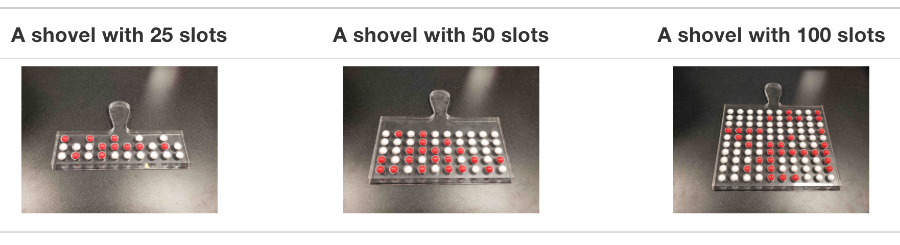
What happens to the sampling distribution when we change the sample size? Instead of always using a shovel that scoops 50 balls, consider using shovels of three different sizes, as shown in FigureΒ 7.1.11.
Three shovels of different sizes used to extract samples of 25, 50, and 100 balls respectively.
Figure 7.1.11. Three shovels to extract three different sample sizes.
The following code computes 1000 sample proportions for each of three sample sizes (25, 50, and 100) and displays the resulting histograms:
# Segment 1: sample size = 25 ------------------------------
# 1.a) Compute sample proportions for 1000 samples, each sample of size 25
virtual_prop_red_25 <- bowl |>
  rep_slice_sample(n = 25, reps = 1000) |>
  summarize(prop_red = mean(color == "red"))

# 1.b) Plot a histogram to represent the distribution of the sample proportions
ggplot(virtual_prop_red_25, aes(x = prop_red)) +
  geom_histogram(binwidth = 0.05, boundary = 0.4, color = "white") +
  labs(x = "Proportion of 25 balls that were red", title = "25")


# Segment 2: sample size = 50 ------------------------------
# 2.a) Compute sample proportions for 1000 samples, each sample of size 50
virtual_prop_red_50 <- bowl |>
  rep_slice_sample(n = 50, reps = 1000) |>
  summarize(prop_red = mean(color == "red"))

# 2.b) Plot a histogram to represent the distribution of the sample proportions
ggplot(virtual_prop_red_50, aes(x = prop_red)) +
  geom_histogram(binwidth = 0.05, boundary = 0.4, color = "white") +
  labs(x = "Proportion of 50 balls that were red", title = "50")


# Segment 3: sample size = 100 ------------------------------
# 3.a) Compute sample proportions for 1000 samples, each sample of size 100
virtual_prop_red_100 <- bowl |>
  rep_slice_sample(n = 100, reps = 1000) |>
  summarize(prop_red = mean(color == "red"))

# 3.b) Plot a histogram to represent the distribution of the sample proportions
ggplot(virtual_prop_red_100, aes(x = prop_red)) +
  geom_histogram(binwidth = 0.05, boundary = 0.4, color = "white") +
  labs(x = "Proportion of 100 balls that were red", title = "100")
Three histograms side by side showing the distribution of sample proportions for sample sizes of 25, 50, and 100 balls respectively.
Figure 7.1.12. Histograms of sample proportions for different sample sizes.
Comparing the three histograms in FigureΒ 7.1.12, we observe three important features:
  1. All three histograms are centered around the same value, slightly below 0.4, close to the true population proportion of 0.375.
  2. All three histograms are somewhat bell-shaped.
  3. As the sample size increases from 25 to 50 to 100, the sampling variation decreases: the histograms become narrower. Larger samples produce sample proportions that are more consistently close to the true population proportion.
Exercises Exercises