Section 2.9 Conclusion
Subsection 2.9.1 Summary table
Let’s recap all five of the five named graphs (5NG) in Table 2.9.1 summarizing their differences. Using these 5NG, you’ll be able to visualize the distributions and relationships of variables contained in a wide array of datasets. This will be even more the case as we start to map more variables to more of each
geometric object’s aesthetic attribute options, further unlocking the awesome power of the ggplot2 package.
| Named graph | Shows | Geometric object | Notes | |
|---|---|---|---|---|
| 1 | Scatterplot | Relationship between 2 numerical variables | geom_point() |
|
| 2 | Linegraph | Relationship between 2 numerical variables | geom_line() |
Used when there is a sequential order to x-variable, e.g., time |
| 3 | Histogram | Distribution of 1 numerical variable | geom_histogram() |
Facetted histograms show the distribution of 1 numerical variable split by the values of another variable |
| 4 | Boxplot | Distribution of 1 numerical variable split by the values of another variable | geom_boxplot() |
|
| 5 | Barplot | Distribution of 1 categorical variable |
geom_bar() when counts are not pre-counted, geom_col() when counts are pre-counted |
Stacked, side-by-side, and faceted barplots show the joint distribution of 2 categorical variables |
Subsection 2.9.2 Function argument specification
Let’s go over some important points about specifying the arguments (i.e., inputs) to functions. Run the following two segments of code:
# Segment 1:
ggplot(data = flights, mapping = aes(x = carrier)) +
  geom_bar()

# Segment 2:
ggplot(flights, aes(x = carrier)) +
  geom_bar()
You’ll notice that both code segments create the same barplot, even though in the second segment we omitted the
data = and mapping = code argument names. This is because the ggplot() function by default assumes that the data argument comes first and the mapping argument comes second. As long as you specify the data frame in question first and the aes() mapping second, you can omit the explicit statement of the argument names data = and mapping = .
Going forward for the rest of this book, all
ggplot() code will be like the second segment: with the data = and mapping = explicit naming of the argument omitted with the default ordering of arguments respected. We’ll do this for brevity’s sake; it’s common to see this style when reviewing other R users’ code.
Subsection 2.9.3 Additional resources
An R script file of all R code used in this chapter is available here.
If you want to further unlock the power of the
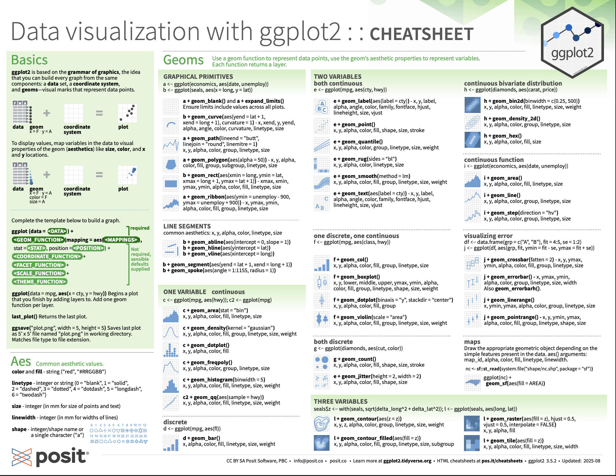
ggplot2 package for data visualization, we suggest that you check out RStudio’s “Data Visualization with ggplot2” cheatsheet. This cheatsheet summarizes much more than what we’ve discussed in this chapter. In particular, it presents many more than the 5 geometric objects we covered in this chapter while providing quick and easy-to-read visual descriptions. For all the geometric objects, it also lists all the possible aesthetic attributes one can tweak. In the current version of RStudio in mid-2025, you can access this cheatsheet by going to the RStudio Menu Bar \(o\) Help \(o\) Cheatsheets \(o\) “Data Visualization with ggplot2.” Alternatively, you can download the cheat sheet by going to the Posit Cheatsheets page.
Subsection 2.9.4 What’s to come
Recall in Figure 2.3.2 in Section 2.3 we visualized the relationship between departure delay and arrival delay for Envoy Air flights only, rather than all flights. This data is saved in the
envoy_flights data frame from the moderndive package.
In reality, the
envoy_flights data frame is merely a subset of the flights data frame from the nycflights23 package consisting of all flights that left NYC in 2023. We created envoy_flights using the following code that uses the dplyr package for data wrangling:
library(dplyr)

envoy_flights <- flights |>
  filter(carrier == "MQ")

ggplot(data = envoy_flights, mapping = aes(x = dep_delay, y = arr_delay)) +
  geom_point()
This code takes the
flights data frame and filter()s it to only return the rows where carrier is equal to "MQ", Envoy Air’s carrier code. (Recall from Section 1.2 that testing for equality is specified with == and not =.) The code then cycles back to save the output in a new data frame called envoy_flights using the <- assignment operator.
Similarly, recall in Figure 2.4.3 in Section 2.4 we visualized hourly wind speed recordings at Newark airport only for the first 15 days of January 2023. This data is saved in the
early_january_2023_weather data frame from the moderndive package.
In reality, the
early_january_2023_weather data frame is merely a subset of the weather data frame from the nycflights23 package consisting of all hourly weather observations in 2023 for all three NYC airports. We created early_january_2023_weather using the following dplyr code:
early_january_2023_weather <- weather |>
  filter(origin == "EWR" & month == 1 & day <= 15)

ggplot(data = early_january_2023_weather, mapping = aes(x = time_hour, y = temp)) +
  geom_line()
This code pares down the
weather data frame to a new data frame early_january_2023_weather consisting of hourly wind speed recordings only for origin == "EWR", month == 1, and day less than or equal to 15.
These two code segments are a preview of Chapter 3 on data wrangling using the
dplyr package. Data wrangling is the process of transforming and modifying existing data with the intent of making it more appropriate for analysis purposes. For example, these two code segments used the filter() function to create new data frames (envoy_flights and early_january_2023_weather) by choosing only a subset of rows of existing data frames (flights and weather). In the next chapter, we’ll formally introduce the filter() and other data-wrangling functions as well as the pipe operator |> which allows you to combine multiple data-wrangling actions into a single sequential chain of actions. On to Chapter 3 on data wrangling!

