Exercises 7.8 Exercises

1. Exercise 7.1.

The thinkstats module provides a function called decile_plot that encapsulates the code from earlier in this chapter. We can call it like this to visualize the relationship between SAT verbal and math scores.
Listing 7.8.1. Python Code
from thinkstats import decile_plot

decile_plot(nlsy, "sat_verbal", "sat_math")
decorate(xlabel="SAT Verbal", ylabel="SAT Math")
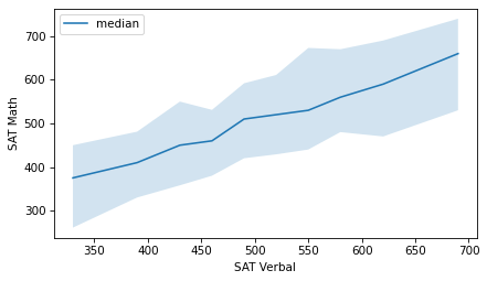
Figure 7.8.2.
Make a decile plot of PIAT math scores and income. Does it appear to be a linear relationship?
2. Exercise 7.2.

Make a scatter plot of income versus SAT math scores. Compute Pearson’s correlation and rank correlation. Are they substantially different?
Make a scatter plot of income versus SAT verbal scores, and compute both correlations. Which is a stronger prediction of future income, math or verbal scores?

3. Exercise 7.3.

Let’s see how a student’s high school grade point average (GPA) is correlated with their SAT scores. Here’s the variable in the NLSY dataset that encodes GPA.
Listing 7.8.3. Python Code
$ missing_codes = [-6, -7, -8, -9]
nlsy["gpa"] = nlsy["R9871900"].replace(missing_codes, np.nan) / 100
nlsy["gpa"].describe()
count    6004.000000
mean        2.818408
std         0.616357
min         0.100000
25%         2.430000
50%         2.860000
75%         3.260000
max         4.170000
Name: gpa, dtype: float64
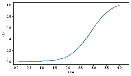
And here’s what the distribution of GPAs looks like.
Listing 7.8.4. Python Code
cdf_income = Cdf.from_seq(nlsy["gpa"])
cdf_income.step()
decorate(xlabel="GPA", ylabel="CDF")
Figure 7.8.5.
Make a scatter plot that shows the relationship between GPA and SAT math scores and compute the correlation coefficient. Do the same for the relationship between GPA and SAT verbal scores. Which SAT score is a better predictor of GPA?

4. Exercise 7.4.

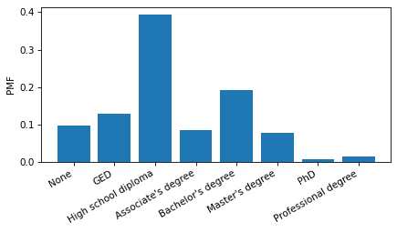
Let’s investigate the relationship between education and income. The NLSY dataset includes a column that reports the highest degree earned by each respondent. The values are encoded as integers.
Listing 7.8.6. Python Code
$ nlsy["degree"] = nlsy["Z9083900"]
nlsy["degree"].value_counts().sort_index()
degree
0.0     877
1.0    1167
2.0    3531
3.0     766
4.0    1713
5.0     704
6.0      64
7.0     130
Name: count, dtype: int64
But we can use these lists to decode them.
Listing 7.8.7. Python Code
positions = [0, 1, 2, 3, 4, 5, 6, 7]
labels = [
    "None",
    "GED",
    "High school diploma",
    "Associate's degree",
    "Bachelor's degree",
    "Master's degree",
    "PhD",
    "Professional degree",
]
And make a Pmf that represents the distribution of educational attainment.
Listing 7.8.8. Python Code
from empiricaldist import Pmf

Pmf.from_seq(nlsy["degree"]).bar()

plt.xticks(positions, labels, rotation=30, ha="right")
decorate(ylabel="PMF")
Figure 7.8.9.
Make a scatter plot of income versus degree. To avoid overplotting, jitter the values of degree and adjust the marker size and transparency.
Use the groupby method to group respondents by degree. From the DataFrameGroupBy object, select the income column; then use the quantile method to compute the median, 10th and 90th percentiles in each group. Use fill_between to plot the region between the 10th and 90th percentiles, and use plot to plot the medians.
What can you say about the income premium associated with each additional degree?

5. Exercise 7.5.

The Behavioral Risk Factor Surveillance System (BRFSS) dataset includes self-reported heights and weights for about 400,000 respondents. Instructions for downloading the data are in the notebook for this chapter.
Make a scatter plot that shows the relationship between height and weight. You might have to jitter the data to blur the visible rows and columns due to rounding. And with such a large sample, you will have to adjust the marker size and transparency to avoid overplotting. Also, because there are outliers in both measurements, you might want to use xlim and ylim to zoom in on a region that covers most of the respondents.
Here’s how we can load the data.
Listing 7.8.10. Python Code
download("https://github.com/AllenDowney/ThinkStats/raw/v3/data/CDBRFS08.ASC.gz")
Listing 7.8.11. Python Code
$ from thinkstats import read_brfss

brfss = read_brfss()
brfss["htm3"].describe()
count    409129.000000
mean        168.825190
std          10.352653
min          61.000000
25%         160.000000
50%         168.000000
75%         175.000000
max         236.000000
Name: htm3, dtype: float64
Make a decile plot of weight versus height. Does the relationship seem to be linear? Compute the correlation coefficient and rank correlation. Are they substantially different? Which one do you think better quantifies the relationship between these variables?