Section 7.4 Strength of Correlation
As you look at more scatter plots, you will get a sense of what different correlations look like. To help you develop this sense, the following figure shows scatter plots for randomly-generated data with the different correlations.
np.random.seed(17)
xs = np.random.normal(size=300)
ys = np.random.normal(size=300)
from thinkstats import make_correlated_scatter

plt.figure(figsize=(10, 2.5))

for i, rho in enumerate([0, 0.3, 0.7, 0.99]):
    plt.subplot(1, 4, i + 1)
    make_correlated_scatter(xs, ys, rho)
decorate()
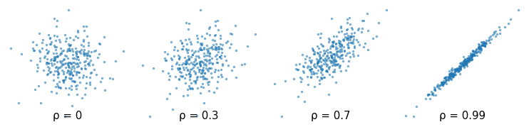
The Greek letter ρ, which is spelled "rho" and pronounced like "row", is the conventional symbol for the correlation coefficient.
Correlation can also be negative. Here are scatter plots for random data with a range of negative correlations.
plt.figure(figsize=(10, 2.5))

for i, rho in enumerate([-0.1, -0.3, -0.7, -0.99]):
    plt.subplot(1, 4, i + 1)
    make_correlated_scatter(xs, ys, rho)
decorate()
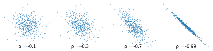
The correlation coefficient is always between -1 and 1. If there is no relationship between two variables, their correlation is 0 -- but if the correlation is 0, that doesn’t necessarily mean there is no relationship.
In particular, if there is a non-linear relationship, the correlation coefficient can be close to 0. In each of the following examples, there is a clear relationship between the variables in the sense that if we are given one of the values, we can make a substantially better prediction of the other. But in each case the correlation coefficient is close to 0.
from thinkstats import make_nonlinear_scatter

plt.figure(figsize=(10, 2.5))

for i, kind in enumerate(["abs", "quadratic", "sinusoid"]):
    plt.subplot(1, 4, i + 1)
    make_nonlinear_scatter(xs, ys, kind)
decorate()
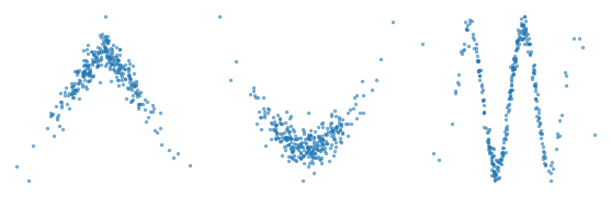
Correlation quantifies the strength of a linear relationship between variables. If there is a non-linear relationship, the correlation coefficient can be misleading. And if the correlation is close to 0, that does not mean there is no relationship.

