Section 12.2 Decomposition
As a first example, we’ll look at how electricity generation from nuclear reactors changed over the interval from January 2001 to June 2024, and we’ll decompose the time series into a long-term trend and a periodic component. Here are monthly totals of electricity generation from nuclear reactors in the United States.
actual_options = dict(color="C0", lw=1, alpha=0.6)
trend_options = dict(color="C1", alpha=0.6)
pred_options = dict(color="C2", alpha=0.6, ls=':')
model_options = dict(color="gray", alpha=0.6, ls='--')
nuclear = elec["United States : nuclear"]
nuclear.plot(label="nuclear", **actual_options)

decorate(ylabel="GWh")
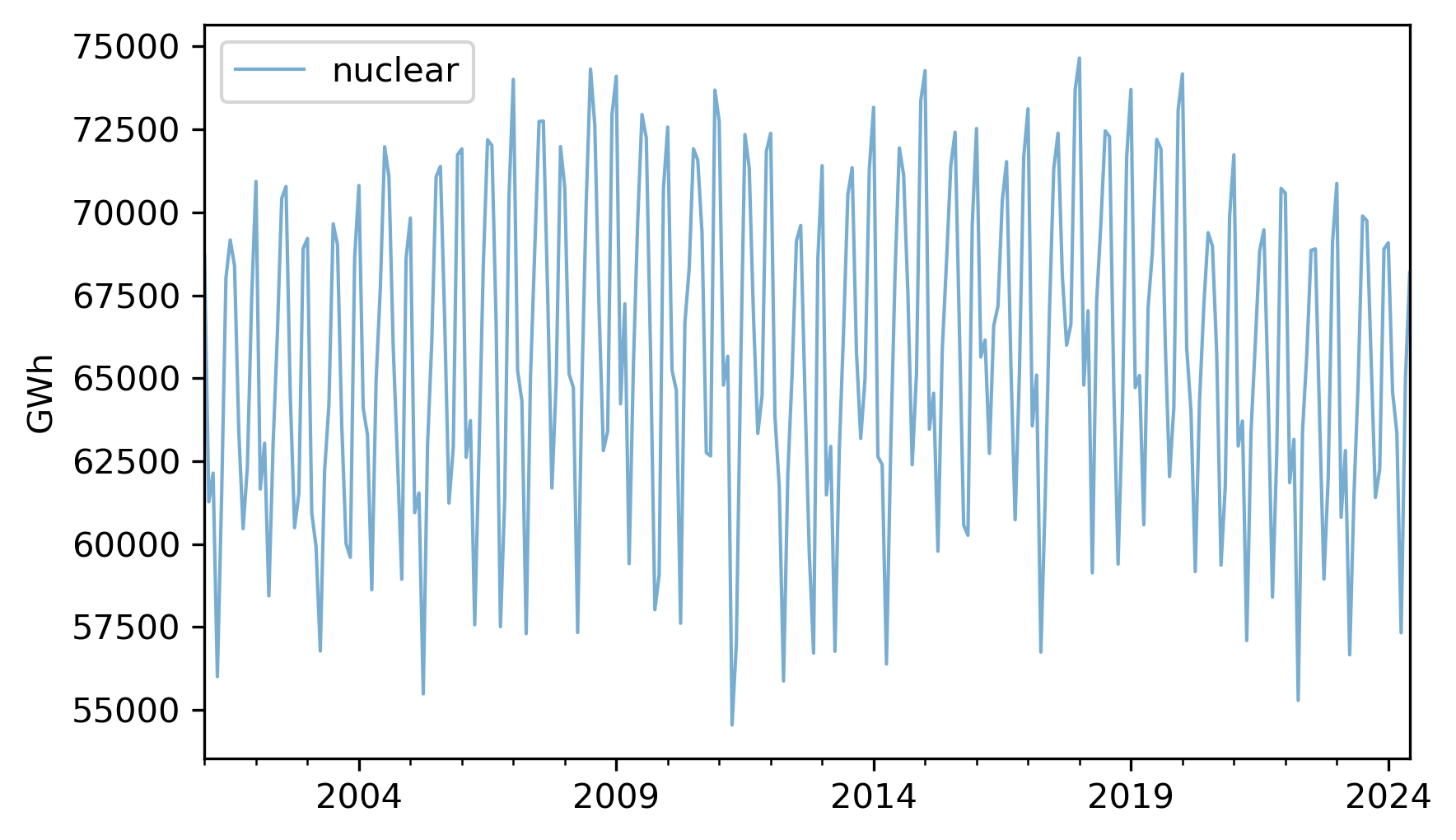
It looks like there are some increases and decreases, but they are hard to see clearly because there are large variations from month to month. To see the long-term trend more clearly, we can use the
rolling and mean methods to compute a moving average.
trend = nuclear.rolling(window=12).mean()
The
window=12 argument selects overlapping intervals of 12 months, so the first interval contains 12 measurements starting with the first, the second interval contains 12 measurements starting with the second, and so on. For each interval, we compute the mean production.
Here’s what the results look like, along with the original data.
nuclear.plot(label="nuclear", **actual_options)
trend.plot(label="trend", **trend_options)
decorate(ylabel="GWh")
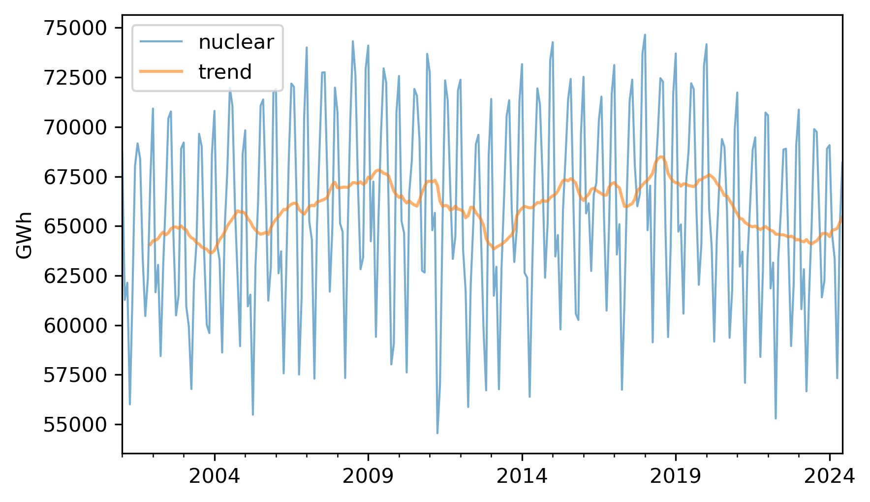
The trend is still quite variable. We could smooth it more by using a longer window, but we’ll stick with the 12-month window for now.
If we subtract the trend from the original data, the result is a "detrended" time series, which means that the long-term mean is close to constant. Here’s what it looks like.
detrended = (nuclear - trend).dropna()
detrended.plot(label="detrended", **actual_options)
decorate(ylabel="GWh")
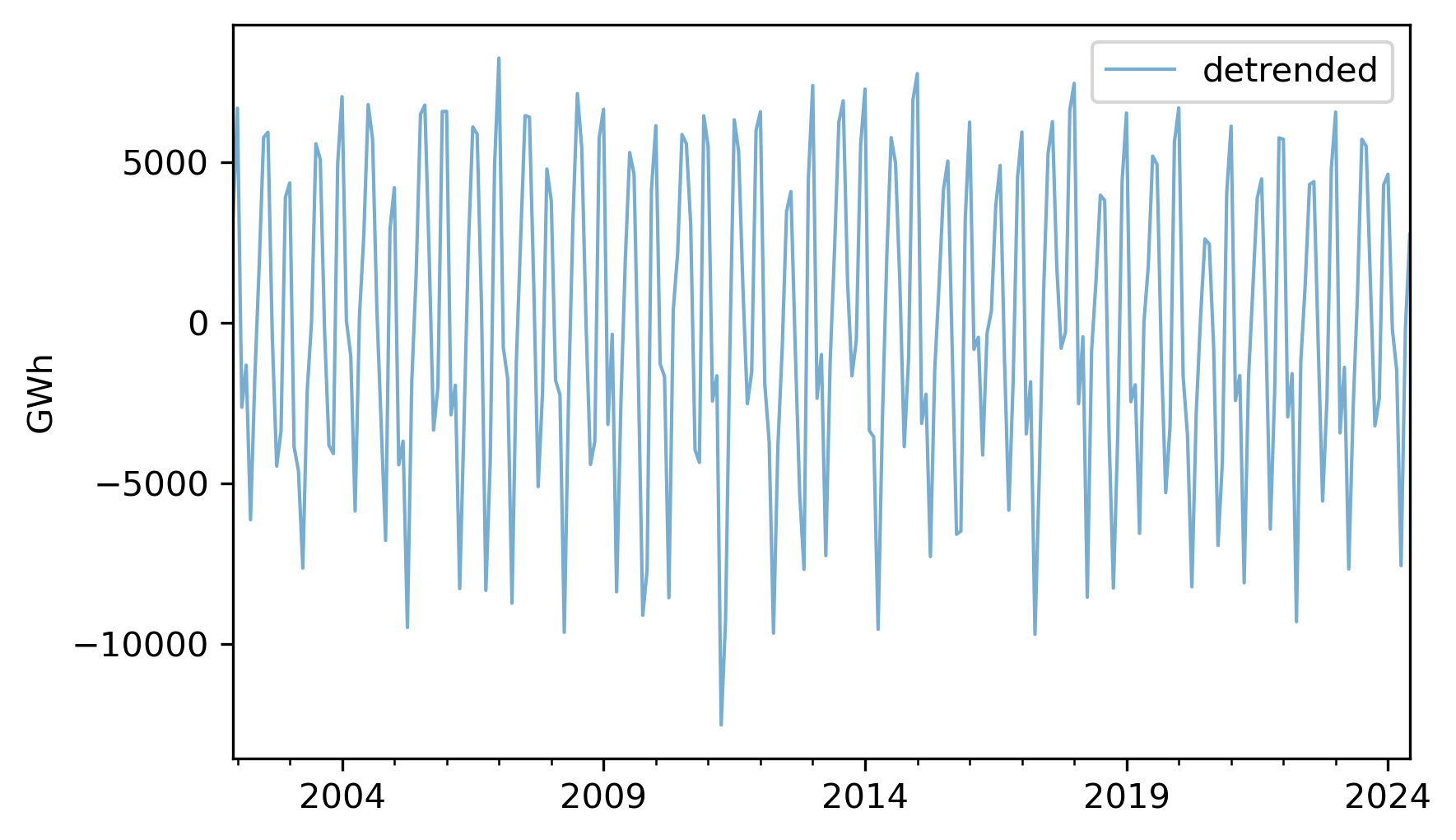
It seems like there is a repeating annual pattern, which makes sense because demand for electricity varies from one season to another, as it is used to generate heat in the winter and run air conditioning in the summer. To describe this annual pattern we can select the month part of the
datetime objects in the index, group the data by month, and compute average production. Here’s what the monthly averages look like.
monthly_averages = detrended.groupby(detrended.index.month).mean()
monthly_averages.plot(label="monthly average", **actual_options)
decorate(ylabel="GWh")
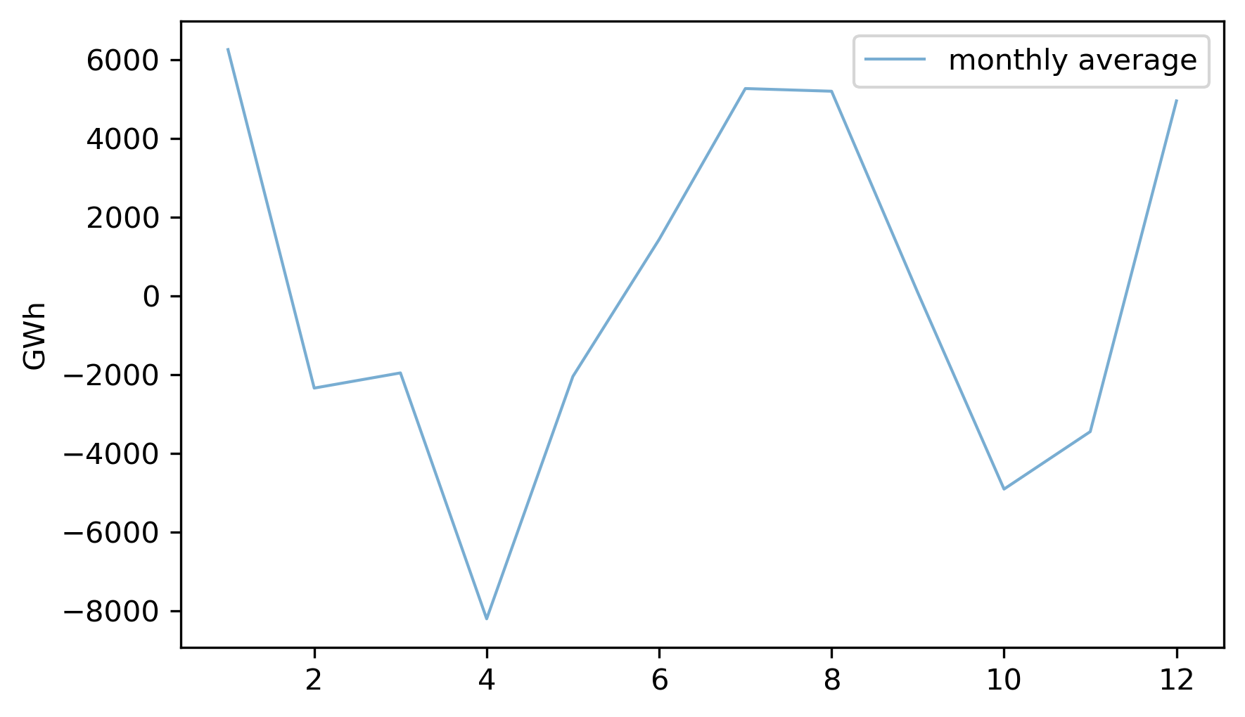
On the x-axis, month 1 is January and month 12 is December. Electricity production is highest during the coldest and warmest months, and lowest during April and October.
We can use
monthly_averages to construct the seasonal component of the data, which is a series the same length as nuclear, where the element for each month is the average for that month. Here’s what it looks like.
seasonal = monthly_averages[nuclear.index.month]
seasonal.index = nuclear.index
seasonal.plot(label="seasonal", **actual_options)
decorate(ylabel="GWh")
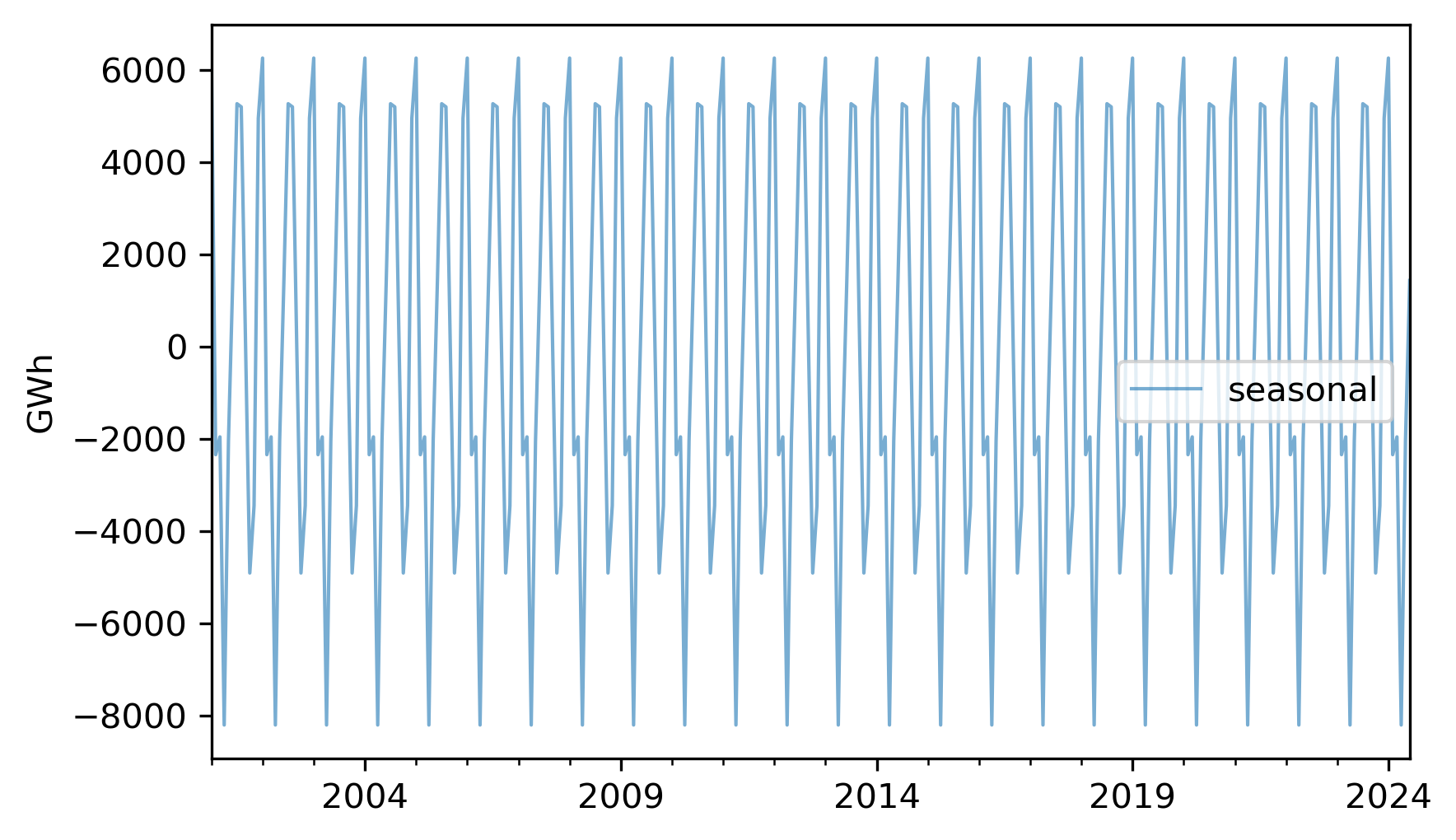
Each 12-month period is identical to the others.
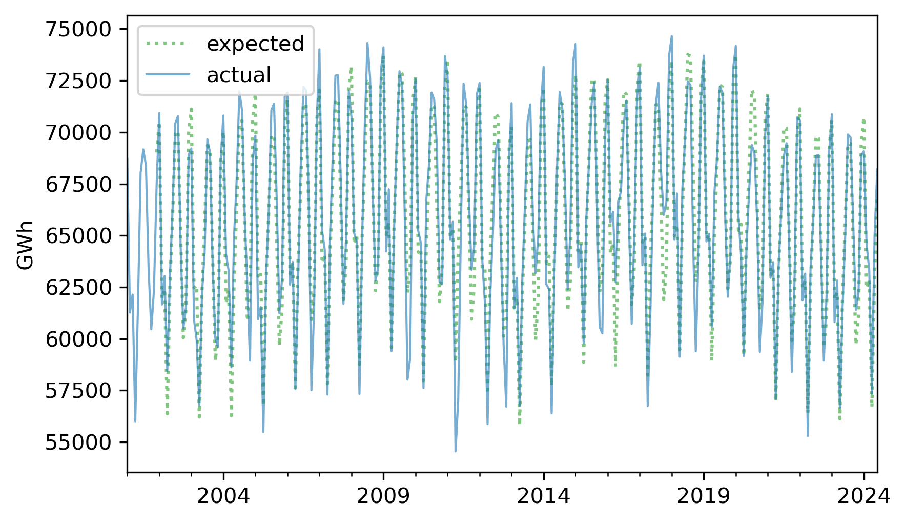
The sum of the trend and the seasonal component represents the expected value for each month.
expected = trend + seasonal
Here’s what it looks like compared to the original series.
expected.plot(label="expected", **pred_options)
nuclear.plot(label="actual", **actual_options)
decorate(ylabel="GWh")
If we subtract this sum from the original series, the result is the residual component, which represents the departure from the expected value for each month.
resid = nuclear - expected
resid.plot(label="residual", **actual_options)
decorate(ylabel="GWh")
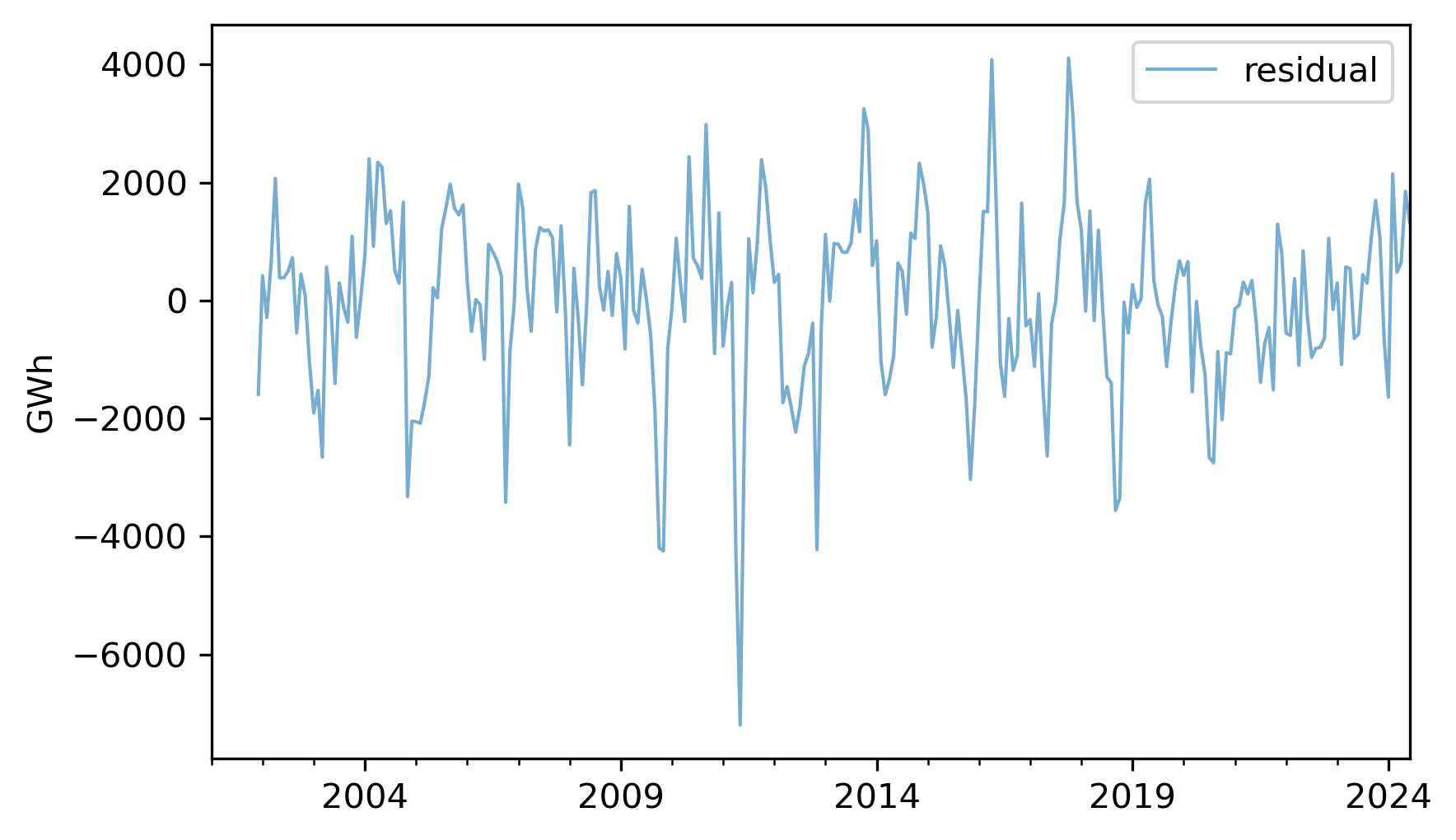
We can think of the residual as the sum of everything in the world that affects energy production, but is not explained by the long-term trend or the seasonal component. Among other things, that sum includes weather, equipment that’s down for maintenance, and changes in demand due to specific events. Since the residual is the sum of many unpredictable, and sometimes unknowable, factors, we often treat it as a random quantity.
Here’s what the distribution of the residuals look like.
from thinkstats import plot_kde

plot_kde(resid.dropna())
decorate(xlabel="Residual (GWh)", ylabel="Density")
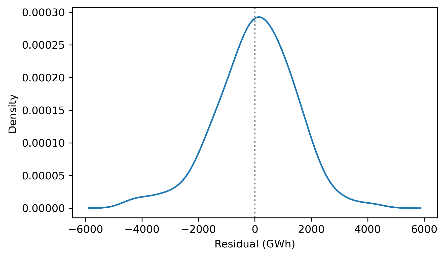
It resembles the bell curve of the normal distribution, which is consistent with the assumption that it is the sum of many random contributions.
To quantify how well this model describes the original series, we can compute the coefficient of determination, which indicates how much smaller the variance of the residuals is, compared to the variance of the original series.
$ rsquared = 1 - resid.var() / nuclear.var()
rsquared
np.float64(0.9054559977517084)
The \(R^2\) value is about 0.92, which means that the long-term trend and seasonal component account for 92% of the variability in the series. This \(R^2\) is substantially higher than the ones we saw in the previous chapter, but that’s common with time series data -- especially in a case like this where we’ve constructed the model to resemble the data.
The process we’ve just walked through is called seasonal decomposition. StatsModels provides a function that does it, called
seasonal_decompose.
from statsmodels.tsa.seasonal import seasonal_decompose

decomposition = seasonal_decompose(nuclear, model="additive", period=12)
The
model="additive" argument indicates the additive model, so the series is decomposed into the sum of a trend, seasonal component, and residual. We’ll see the multiplicative model soon. The period=12 argument indicates that the duration of the seasonal component is 12 months.
The result is an object that contains the three components. The notebook for this chapter provides a function that plots them.
def plot_decomposition(original, decomposition):
    plt.figure(figsize=(6, 5))

    ax1 = plt.subplot(4, 1, 1)
    plt.plot(original, label="Original", color="C0", lw=1)
    plt.ylabel("Original")

    plt.subplot(4, 1, 2, sharex=ax1)
    plt.plot(decomposition.trend, label="Trend", color="C1", lw=1)
    plt.ylabel("Trend")

    plt.subplot(4, 1, 3, sharex=ax1)
    plt.plot(decomposition.seasonal, label="Seasonal", color="C2", lw=1)
    plt.ylabel("Seasonal")

    plt.subplot(4, 1, 4, sharex=ax1)
    plt.plot(decomposition.resid, label="Residual", color="C3", lw=1)
    plt.ylabel("Residual")

    plt.tight_layout()
plot_decomposition(nuclear, decomposition)
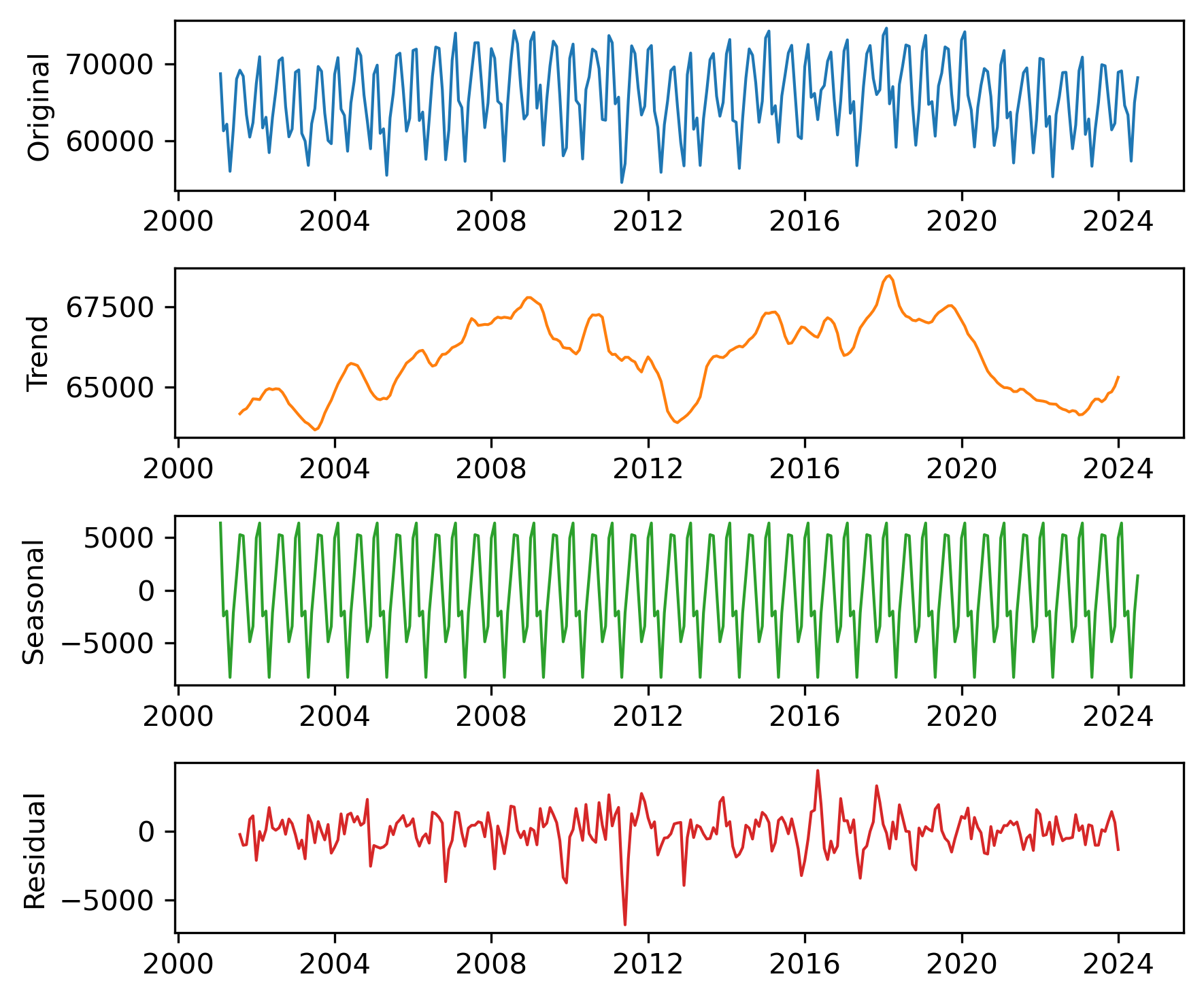
The results are similar to those we computed ourselves, with small differences due to the details of the implementation.
This kind of seasonal decomposition provides insight into the structure of a time series. As we’ll see in the next section, it is also useful for making forecasts.

