Section 10.5 Visualizing Uncertainty
Each time we resample the dataset, we get a different fitted line. To see how much variation there is in the lines, one option is to loop through them and plot them all. The following function takes a resampled
DataFrame, computes a least squares fit, and generates predicted values for a sequence of xs.
def fit_line(df, fit_xs):
    xs, ys = df["Flipper Length (mm)"], df["Body Mass (g)"]
    result = linregress(xs, ys)
    fit_ys = predict(result, fit_xs)
    return fit_ys
Here’s the sequence of
xs we’ll use.
xs = adelie["Flipper Length (mm)"]
fit_xs = np.linspace(np.min(xs), np.max(xs))
And here’s what the fitted lines look like, along with a scatter plot of the data.
plt.scatter(flipper_length, body_mass, marker=".", alpha=0.5)

for i in range(101):
    fit_ys = fit_line(resample(adelie), fit_xs)
    plt.plot(fit_xs, fit_ys, color="C1", alpha=0.05)

decorate(xlabel=xvar, ylabel=yvar)
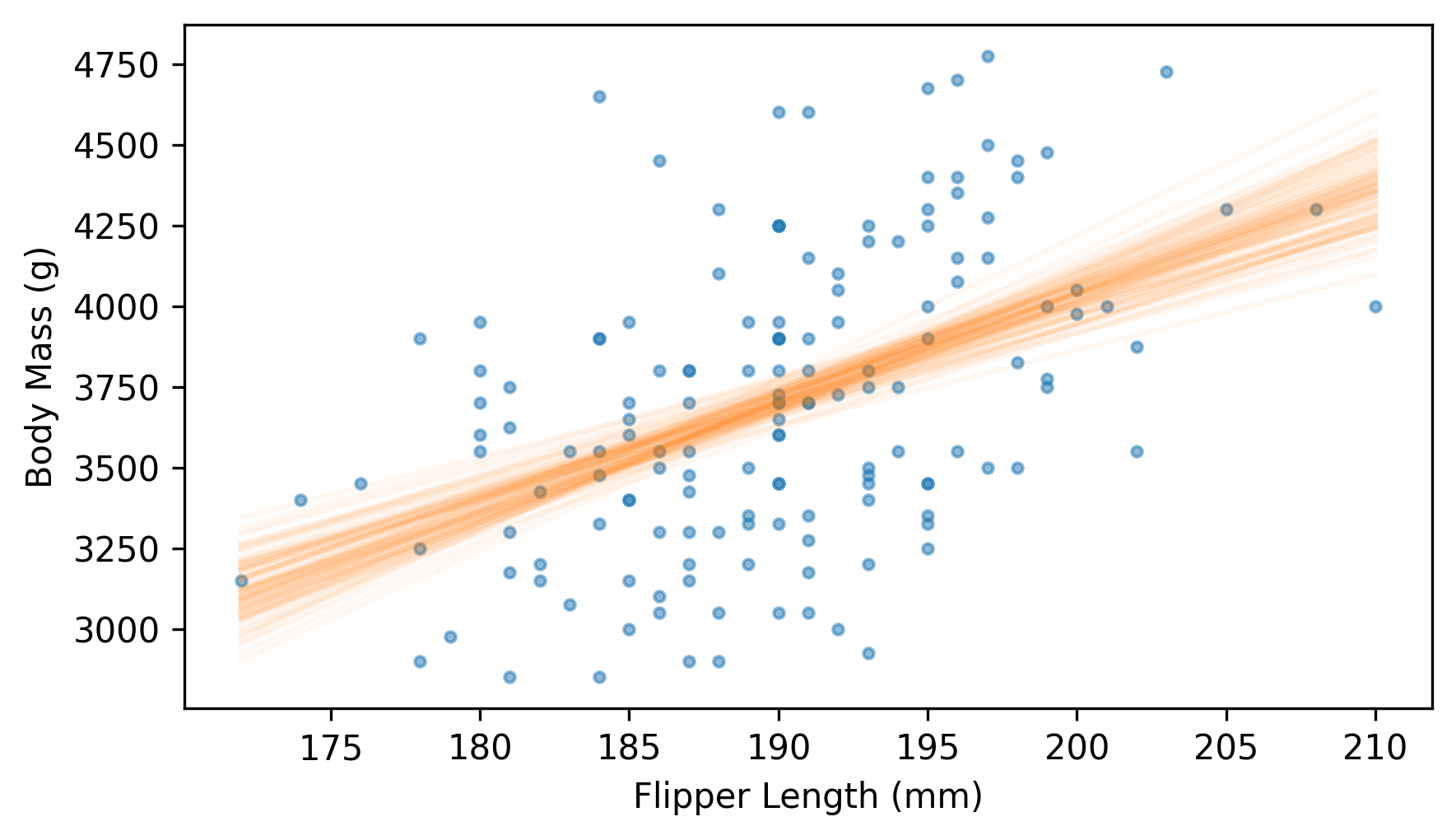
Near the middle, the fitted lines are close together -- at the extremes, they are farther apart.
Another way to represent the variability of the fitted lines is to plot a 90% confidence interval for each predicted value. We can do that by collecting the fitted lines as a list of arrays.
fitted_ys = [fit_line(resample(adelie), fit_xs) for i in range(1001)]
We can think of this list of arrays as a two-dimensional array with one row for each fitted line and one column corresponding to each of the
xs.
We can use
percentile with the axis=0 argument to find the 5th, 50th, and 95th percentiles of the ys corresponding to each of the xs.
low, median, high = np.percentile(fitted_ys, [5, 50, 95], axis=0)
Now we’ll use
fill_between to plot a region between the 5th and 95 percentiles, which represents the 90% CI, along with the median value in each column and a scatter plot of the data.
plt.scatter(flipper_length, body_mass, marker=".", alpha=0.5)

plt.fill_between(fit_xs, low, high, color="C1", lw=0, alpha=0.2)
plt.plot(fit_xs, median, color="C1")

decorate(xlabel=xvar, ylabel=yvar)
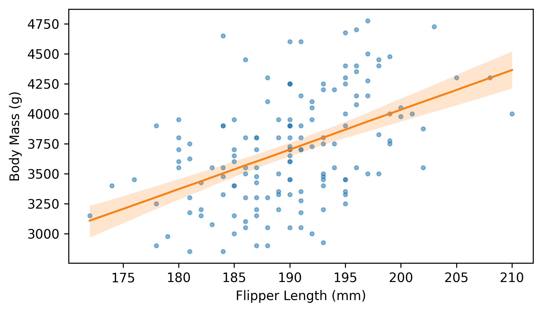
This is my favorite way to represent the variability of a fitted line due to random sampling.

