Section 7.5 Rank Correlation
The NLSY is longitudinal, which means that it follows the same group of people over time. The group we’ve been studying includes people born between 1980 and 1984. The ones who took the SAT probably took it in the late 1990s, when they were about 18 years old. So when they were asked about their income in 2021, they were in their late 30s or early 40s. Let’s give the column with the income data a more interpretable name.
$ nlsy["income"] = nlsy["U4949700"]
nlsy["income"].describe()
count      6051.000000
mean     104274.239960
std      108470.571497
min           0.000000
25%       38000.000000
50%       80000.000000
75%      134157.000000
max      599728.000000
Name: income, dtype: float64
The values in this column are gross family income, which is total income of the respondent and the other members of their household, from all sources, reported in U.S. dollars (USD). Here’s what the distribution of income looks like.
cdf_income = Cdf.from_seq(nlsy["income"])
cdf_income.step()

decorate(xlabel="Income (USD)", ylabel="CDF")
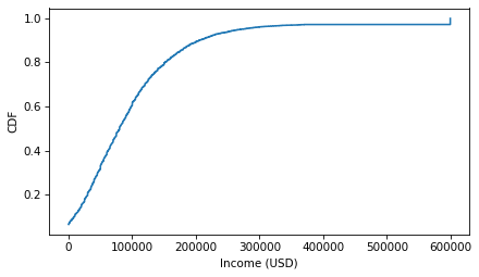
Notice the step near $600,000 -- values above this threshold were capped to protect the anonymity of the participants. Now here’s a scatter plot of the respondents’ SAT math scores and their income later in life.
scatter(nlsy, "piat_math", "income")

decorate(xlabel="PIAT math", ylabel="Gross Family Income (USD)")
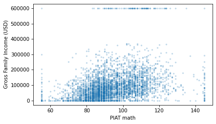
It looks like there is a relationship between these variables. Here is the correlation.
$ corrcoef(nlsy, "piat_math", "income")
np.float64(0.30338587288641233)
The correlation is about 0.3, which means that if someone gets a PIAT math score one standard deviation above the mean when they are 15 years old, we expect their income to be about 0.3 standard deviations above the mean when they are 40. That’s not as strong as the correlation between PIAT scores and SAT scores, but considering the number of factors that affect income, it’s pretty strong.
In fact, Pearson’s correlation coefficient might understate the strength of the relationship. As we can see in the previous scatter plot, both variables have an apparent excess of values at the extremes. Because the correlation coefficient is based on the product of deviations from the mean, it is sensitive to these extreme values.
A more robust alternative is the rank correlation, which is based on the ranks of the scores rather than standardized scores. We can use the Pandas method
rank to compute the rank of each score and each income.
valid = nlsy.dropna(subset=["piat_math", "income"])

piat_math_rank = valid["piat_math"].rank(method="first")
income_rank = valid["income"].rank(method="first")
With the
method="first" argument, rank assigns ranks from 1 to the length of the sequence, which is 4101.
$ income_rank.min(), income_rank.max()
(np.float64(1.0), np.float64(4101.0))
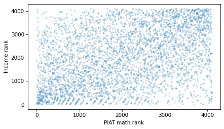
Here’s a scatter plot of income ranks versus math score ranks.
plt.scatter(piat_math_rank, income_rank, s=5, alpha=0.2)

decorate(xlabel="PIAT math rank", ylabel="Income rank")
And here’s the correlation of the ranks.
$ np.corrcoef(piat_math_rank, income_rank)[0, 1]
np.float64(0.38148396696764847)
The result is about 0.38, somewhat higher than the Pearson correlation, which is 0.30. Because rank correlation is less sensitive to the effect of extreme values, it is probably a better measure of the strength of the relationship between these variables.
$ from thinkstats import rankcorr

rankcorr(nlsy, "piat_math", "income")
np.float64(0.38474681505344815)
And SciPy provides a similar function called
spearmanr, because rank correlation is also called Spearman’s correlation.
$ from scipy.stats import spearmanr

spearmanr(valid["piat_math"], valid["income"]).statistic
np.float64(0.38474681505344815)
As an exercise, you’ll have a chance to compute the correlation between SAT verbal scores and income, using both Pearson correlation and rank correlation.

