Section 14.1 Normal Probability Plots
Many analytic methods are based on the properties of the normal distribution, for two reasons: distributions of many measurements in the real world are well-approximated by normal distributions, and normal distributions have mathematical properties that make them useful for analysis.
To demonstrate the first point, we’ll look at some of the measurements in the penguin dataset. Then we’ll explore the mathematical properties of the normal distribution.
The following cell downloads the data from a repository created by Allison Horst.
Horst AM, Hill AP, Gorman KB (2020). palmerpenguins: Palmer Archipelago (Antarctica) penguin data. R package version 0.1.0. https://allisonhorst.github.io/palmerpenguins/. doi: 10.5281/zenodo.3960218.
The data was collected as part of the research that led to this paper: Gorman KB, Williams TD, Fraser WR (2014). Ecological sexual dimorphism and environmental variability within a community of Antarctic penguins (genus Pygoscelis). PLoS ONE 9(3):e90081. https://doi.org/10.1371/journal.pone.0090081
download(
    "https://raw.githubusercontent.com/allisonhorst/palmerpenguins/c19a904462482430170bfe2c718775ddb7dbb885/inst/extdata/penguins_raw.csv"
)
We can read the data like this.
$ penguins = pd.read_csv("penguins_raw.csv")
penguins.shape
(344, 17)
The dataset contains measurements from three penguin species. For this example, we’ll select the Adélie penguins.
$ adelie = penguins.query('Species.str.startswith("Adelie")').copy()
len(adelie)
152
To see if penguin weights follow a normal distribution, we’ll compute the empirical CDF of the data.
from empiricaldist import Cdf

weights = adelie["Body Mass (g)"].dropna()
cdf_weights = Cdf.from_seq(weights)
And we’ll compute the analytic CDF of a normal distribution with the same mean and standard deviation.
$ m, s = weights.mean(), weights.std()
m, s
(np.float64(3700.662251655629), np.float64(458.5661259101348))
from scipy.stats import norm

dist = norm(m, s)
qs = np.linspace(m - 3.5 * s, m + 3.5 * s)
ps = dist.cdf(qs)
Here’s what the CDF of the data looks like compared to the normal model.
model_options = dict(color="gray", alpha=0.5, label="model")
plt.plot(qs, ps, **model_options)
cdf_weights.plot(label="data")

decorate(ylabel="CDF")
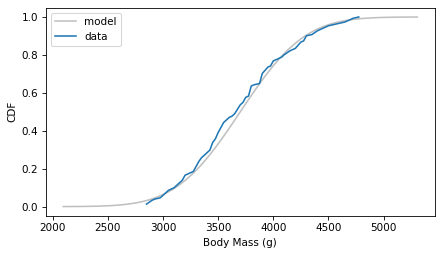
The normal distribution might be a good enough model of this data, but it’s certainly not a perfect fit.
In general, plotting the CDF of the data and the CDF of a model is a good way to evaluate how well the model fits the data. But one drawback of this method is that it depends on how well we estimate the parameters of the model—in this example, the mean and standard deviation.
An alternative is a normal probability plot, which does not depend on our ability to estimate parameters. In a normal probability plot the \(y\) values are the sorted measurements.
ys = np.sort(weights)
And the \(x\) values are the corresponding percentiles of a normal distribution, computed using the
ppf method of the norm object, which computes the “percent point function”, which is the inverse CDF.
n = len(weights)
ps = (np.arange(n) + 0.5) / n
xs = norm.ppf(ps)
If the measurements are actually drawn from a normal distribution, the \(y\) and \(x\) values should fall on a straight line. To see how well they do, we can use
linregress to fit a line.
from scipy.stats import linregress

results = linregress(xs, ys)
intercept, slope = results.intercept, results.slope

fit_xs = np.linspace(-3, 3)
fit_ys = intercept + slope * fit_xs
plt.plot(fit_xs, fit_ys, **model_options)
plt.plot(xs, ys, label="data")

decorate(xlabel="Standard normal", ylabel="Body mass (g)")
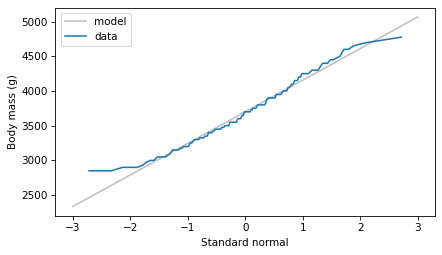
The normal probability plot is not a perfectly straight line, which indicates that the normal distribution is not a perfect model for this data.
One reason is that the dataset includes male and female penguins, and the two groups have different means—let’s see what happens if we plot the groups separately. The following function encapsulates the steps we used to make a normal probability plot.
def normal_probability_plot(sample, **options):
    """Makes a normal probability plot with a fitted line."""
    n = len(sample)
    ps = (np.arange(n) + 0.5) / n
    xs = norm.ppf(ps)
    ys = np.sort(sample)

    results = linregress(xs, ys)
    intercept, slope = results.intercept, results.slope

    fit_xs = np.linspace(-3, 3)
    fit_ys = intercept + slope * fit_xs

    plt.plot(fit_xs, fit_ys, color="gray", alpha=0.5)
    plt.plot(xs, ys, **options)
    decorate(xlabel="Standard normal")
Here’s what the results look like for male and female penguins separately.
grouped = adelie.groupby("Sex")

weights_male = grouped.get_group("MALE")["Body Mass (g)"]
normal_probability_plot(weights_male, ls="--", label="Male")

weights_female = grouped.get_group("FEMALE")["Body Mass (g)"]
normal_probability_plot(weights_female, label="Female")

decorate(ylabel="Weight (g)")
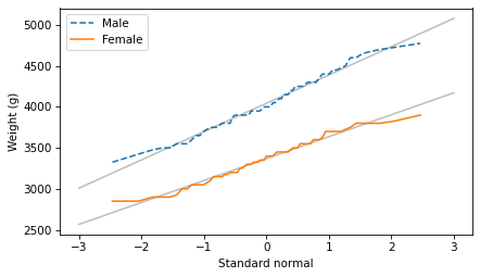
The normal probability plots for both groups are close to a straight line, which indicates that the distributions of weight follow normal distributions. When we put the groups together, the distribution of their weights is a mixture of two normal distributions with different means—and a mixture like that is not always well modeled by a normal distribution.
Now let’s consider some of the mathematical properties of normal distributions that make them so useful for analysis.

