Section 3.4 NSFG Data
In the previous chapter, we plotted frequency tables of pregnancy lengths for first babies and others. But the sizes of the groups are not the same, so we can’t compare the frequency tables directly. Because PMFs are normalized, we can compare them. So let’s load the NSFG data again and make
Pmf objects to represent distributions of pregnancy lengths.
The
nsfg module provides a get_nsfg_groups function that reads the data, selects rows that represent live births, and partitions live births into first babies and others. It returns three DataFrame objects.
try:
    import statadict
except ImportError:
    %pip install statadict
download("https://github.com/AllenDowney/ThinkStats/raw/v3/nb/nsfg.py")
download("https://github.com/AllenDowney/ThinkStats/raw/v3/data/2002FemPreg.dct")
download("https://github.com/AllenDowney/ThinkStats/raw/v3/data/2002FemPreg.dat.gz")
from nsfg import get_nsfg_groups

live, firsts, others = get_nsfg_groups()
first_pmf = Pmf.from_seq(firsts["prglngth"], name="firsts")
other_pmf = Pmf.from_seq(others["prglngth"], name="others")
Here are the PMFs for first babies and others, plotted as bar graphs.
two_bar_plots(first_pmf, other_pmf)
decorate(xlabel="Weeks", ylabel="Probability", xlim=[20, 50])
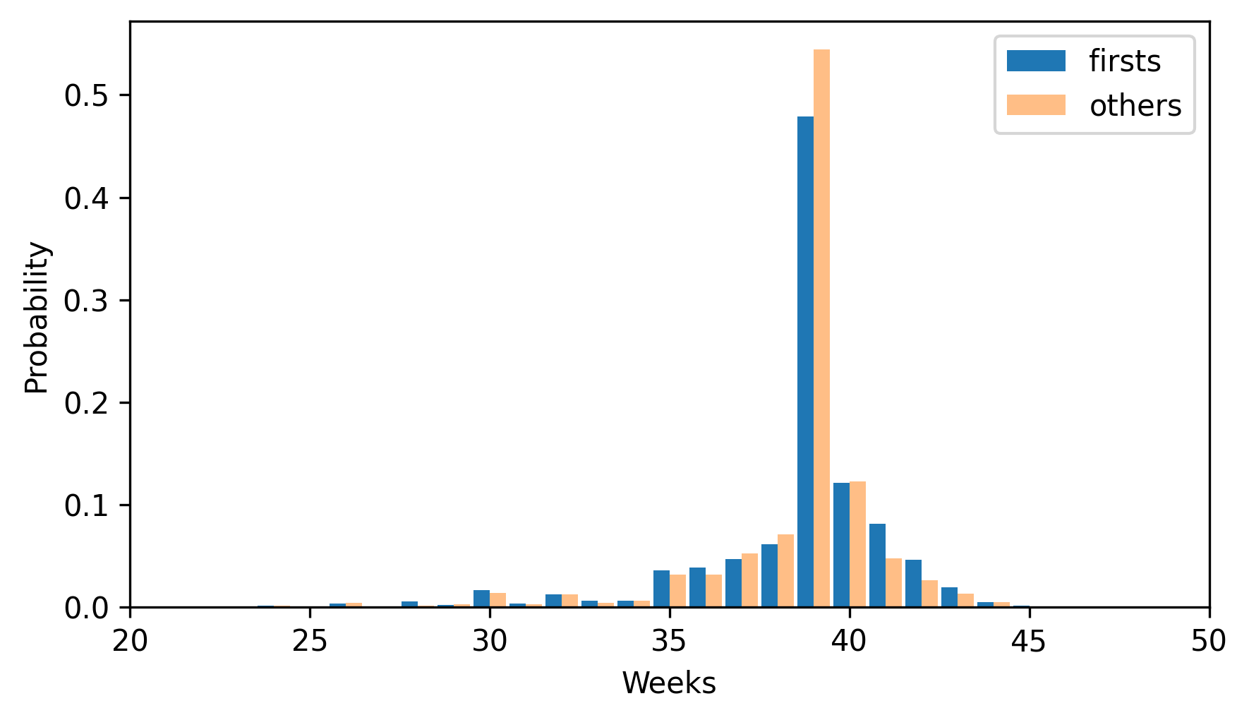
By plotting the PMF instead of the frequency table, we can compare the two distributions without being misled by the difference in sizes of the samples. Based on this figure, first babies seem to be less likely than others to arrive on time (week 39) and more likely to be late (weeks 41 and 42).

