Section 13.8 Confidence Intervals
The Kaplan-Meier estimate we computed is based on a single resampling of the dataset. To get an idea of how much variation there is due to random sampling, we’ll run the analysis with several resamplings and plot the results.
We’ll use the following function, which takes a
DataFrame and a list of cohorts, estimates the survival function for each cohort, and returns a dictionary that maps from each integer cohort to a Surv object.
This function is identical to
make_survival_map, except that it calls estimate_survival, which uses Kaplan-Meier estimation, rather than Surv.from_seq, which only works if there is no censored data.
def estimate_survival_map(resp, cohorts):
    """Make a dictionary from cohorts to Surv objects."""
    surv_map = {}

    grouped = resp.groupby("cohort")
    for cohort in cohorts:
        group = grouped.get_group(cohort)
        surv_map[cohort] = estimate_survival(group)

    return surv_map
The following loop generates 101 random resamplings of the dataset and makes a list of 101 dictionaries containing the estimated survival functions.
cohorts = [1940, 1950, 1960, 1970, 1980, 1990]

surv_maps = [estimate_survival_map(resample_cycles(resp), cohorts) for i in range(101)]
To plot the results, we’ll use the following function, which takes that list of dictionaries, an integer cohort, and a color string. It loops through the dictionaries, selects the survival function for the given cohort, and plots it with a nearly transparent line—which is one way to visualize the variability between resamplings.
def plot_cohort(surv_maps, cohort, color):
    """Plot results for a single cohort."""
    survs = [surv_map[cohort] for surv_map in surv_maps]
    for surv in survs:
        surv.plot(color=color, alpha=0.05)

    x, y = surv.index[-1], surv.iloc[-1]
    plt.text(x + 1, y, f"{cohort}s", ha="left", va="center")
Here are the results for birth cohorts from the 1940s to the 1990s.
colors = [f"C{i}" for i in range(len(cohorts))]

for cohort, color in zip(cohorts, colors):
    plot_cohort(surv_maps, cohort, color)

xlim = [8, 55]
decorate(xlabel="Age", ylabel="Prob never married", xlim=xlim, ylim=ylim)
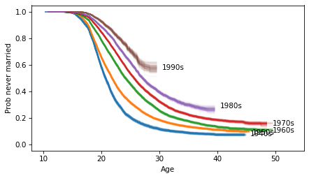
This visualization is good enough for exploration, but the lines look blurry and some of the labels overlap. More work might be needed to make a publication-ready figure, but we’ll keep it simple for now.
Several patterns are visible:
-
Women born in the 1940s married earliest—cohorts born in the 1950s and 1960s married later, but about the same fraction stayed unmarried.
-
Women born in the 1970s married later and stayed unmarried at higher rates than previous cohorts.
-
Cohorts born in the 1980s and 1990s are marrying even later, and are on track to stay unmarried at even higher rates—although these patterns could change in the future.
We’ll have to wait for the next data release from the NSFG to learn more.

