Section 4.3 Comparing CDFs
CDFs are especially useful for comparing distributions. As an example, let’s compare the distribution of birth weights for first babies and others. We’ll load the NSFG dataset again, and divide it into three
DataFrames: all live births, first babies, and others.
The following cells download the data files we need to read the data.
download("https://github.com/AllenDowney/ThinkStats/raw/v3/nb/nsfg.py")
download("https://github.com/AllenDowney/ThinkStats/raw/v3/data/2002FemPreg.dct")
download("https://github.com/AllenDowney/ThinkStats/raw/v3/data/2002FemPreg.dat.gz")
from nsfg import get_nsfg_groups

live, firsts, others = get_nsfg_groups()
From
firsts and others we’ll select total birth weights in pounds, using dropna to remove values that are nan.
$ first_weights = firsts["totalwgt_lb"].dropna()
first_weights.mean()
np.float64(7.201094430437772)
$ other_weights = others["totalwgt_lb"].dropna()
other_weights.mean()
np.float64(7.325855614973262)
It looks like first babies are a little lighter on average. But there are several ways a difference like that could happen — for example, there might be a small number of first babies who are especially light, or a small number of other babies who are especially heavy. In those cases, the distributions would have different shapes. As another possibility, the distributions might have the same shape, but different locations.
To compare the distributions, we can try plotting the PMFs.
from empiricaldist import Pmf

first_pmf = Pmf.from_seq(first_weights, name="first")
other_pmf = Pmf.from_seq(other_weights, name="other")
But as we can see in the following figure, it doesn’t work very well.
from thinkstats import two_bar_plots

two_bar_plots(first_pmf, other_pmf, width=0.06)
decorate(xlabel="Weight (pounds)", ylabel="PMF")
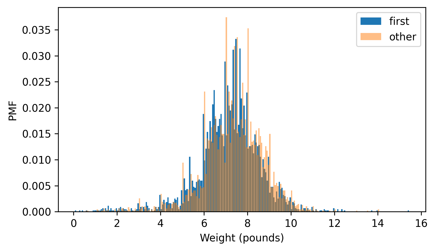
I adjusted the width and transparency of the bars to show the distributions as clearly as possible, but it is hard to compare them. There are many peaks and valleys, and some apparent differences, but it is hard to tell which of these features are meaningful. Also, it is hard to see overall patterns; for example, it is not visually apparent which distribution has the higher mean.
These problems can be mitigated by binning the data — that is, dividing the range of quantities into non-overlapping intervals and counting the number of quantities in each bin. Binning can be useful, but it is tricky to get the size of the bins right. If they are big enough to smooth out noise, they might also smooth out useful information.
A good alternative is to plot the CDFs.
first_cdf = first_pmf.make_cdf()
other_cdf = other_pmf.make_cdf()
Here’s what they look like.
first_cdf.plot(ls="--")
other_cdf.plot(alpha=0.5)
decorate(xlabel="Weight (pounds)", ylabel="CDF")
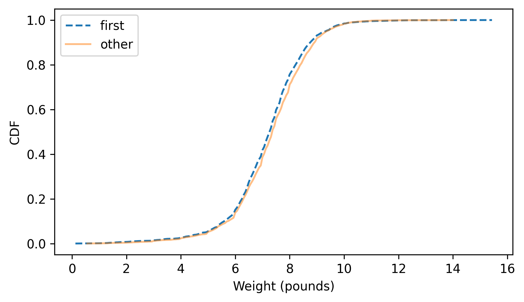
This figure makes the shape of the distributions, and the differences between them, much clearer. The curve for first babies is consistently to the left of the curve for others, which indicates that first babies are slightly lighter throughout the distribution — with a larger discrepancy above the midpoint.

