Section 3.5 Other Visualizations
Frequency tables and PMFs are useful while you are exploring data and trying to identify patterns and relationships. Once you have an idea what is going on, a good next step is to design a visualization that makes the patterns you have identified as clear as possible.
In the NSFG data, the biggest differences in the distributions are near the mode. So it makes sense to zoom in on that part of the graph, and select data from weeks 35 to 46.
When we call a
Pmf object like a function, we can look up a sequence of quantities and get a sequence of probabilities.
$ weeks = range(35, 46)
first_pmf(weeks)
array([0.03602991, 0.03897575, 0.04713347, 0.06163608, 0.4790392 ,
       0.12145932, 0.08157716, 0.04645366, 0.01971448, 0.00521187,
       0.00135962])
$ other_pmf(weeks)
array([0.03210137, 0.03146779, 0.05216473, 0.07074974, 0.54466737,
       0.12249208, 0.04794087, 0.02597677, 0.01288279, 0.00485744,
       0.00084477])
So we can compute the differences in the probabilities like this.
$ diffs = first_pmf(weeks) - other_pmf(weeks)
diffs
array([ 0.00392854,  0.00750796, -0.00503126, -0.00911366, -0.06562817,
       -0.00103276,  0.03363629,  0.02047689,  0.00683169,  0.00035443,
        0.00051485])
Here’s what they look like, multiplied by 100 to express the differences in percentage points.
plt.bar(weeks, diffs * 100)
decorate(xlabel="Weeks", ylabel="Difference (percentage points)")
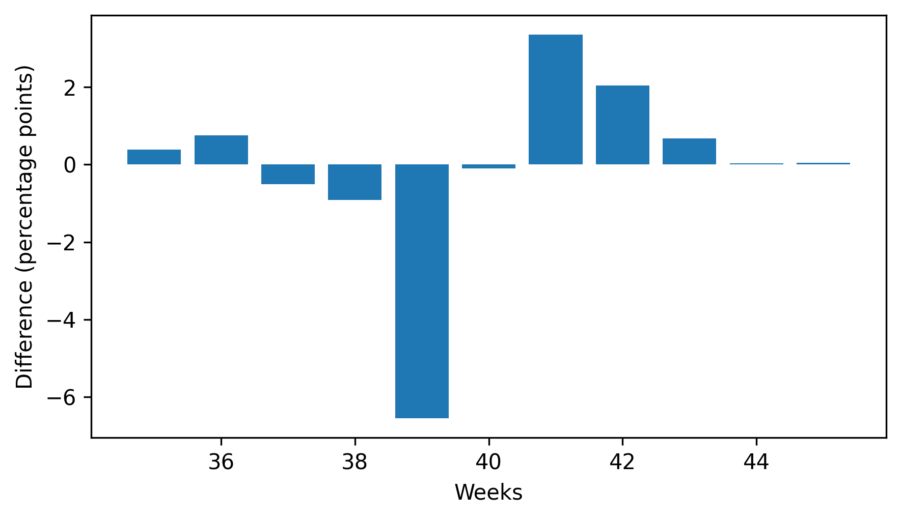
This figure makes the pattern clearer: first babies are less likely to be born in week 39, and somewhat more likely to be born in weeks 41 and 42.
When we see a pattern like this in a sample, we can’t be sure it also holds in the population — and we don’t know whether we would see it in another sample from the same population. We’ll revisit this question in Chapter 9.

