Section 10.6 Transformation
Before fitting a line to data, it is sometimes useful to transform one or both variables, for example by computing the squares of the values, their square roots, or their logarithms. To demonstrate, we’ll use heights and weights from the Behavioral Risk Factor Surveillance System (BRFSS), described in Chapter 5.
The following cell downloads the BRFSS data.
download("https://github.com/AllenDowney/ThinkStats/raw/v3/data/CDBRFS08.ASC.gz")
We can load the BRFSS data like this.
from thinkstats import read_brfss

brfss = read_brfss()
Next we’ll find the rows with valid data and select the columns containing heights and weights.
valid = brfss.dropna(subset=["htm3", "wtkg2"])
heights, weights = valid["htm3"], valid["wtkg2"]
We can use
linregress to compute the slope and intercept of the least squares fit.
$ result_brfss = linregress(heights, weights)
result_brfss.intercept, result_brfss.slope
(np.float64(-82.65926054409877), np.float64(0.957074585033226))
The slope is about 0.96, which means that an increase of 1 centimeter corresponds to an increase of almost 1 kilogram, on average. We can use
predict again to generate predicted values for a range of xs.
fit_xs = np.linspace(heights.min(), heights.max())
fit_ys = predict(result_brfss, fit_xs)
Before we make a scatter plot of the data, it’s useful to jitter the heights and weights.
from thinkstats import jitter

jittered_heights = jitter(heights, 2)
jittered_weights = jitter(weights, 1.5)
And we’ll use the mean and standard deviation of the heights to choose the limits of the \(x\) axis.
m, s = heights.mean(), heights.std()
xlim = m - 4 * s, m + 4 * s
ylim = 0, 200
Here’s a scatter plot of the jittered data along with the fitted line.
plt.scatter(jittered_heights, jittered_weights, alpha=0.01, s=0.1)
plt.plot(fit_xs, fit_ys, color="C1")
decorate(xlabel="Height (cm)", ylabel="Weight (kg)", xlim=xlim, ylim=ylim)
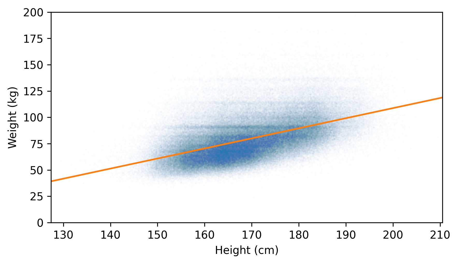
The fitted line doesn’t pass through the densest part of the scatter plot. That’s because the weights don’t follow a normal distribution. As we saw in Chapter 5, adult weights tend to follow a lognormal distribution, which is skewed toward larger values -- and those values pull the fitted line up.
Another cause for concern is the distribution of the residuals, which looks like this.
residuals = compute_residuals(result_brfss, heights, weights)
from thinkstats import make_pmf

pmf_kde = make_pmf(residuals, -60, 120)
pmf_kde.plot()

decorate(xlabel="Residual (kg)", ylabel="Density")
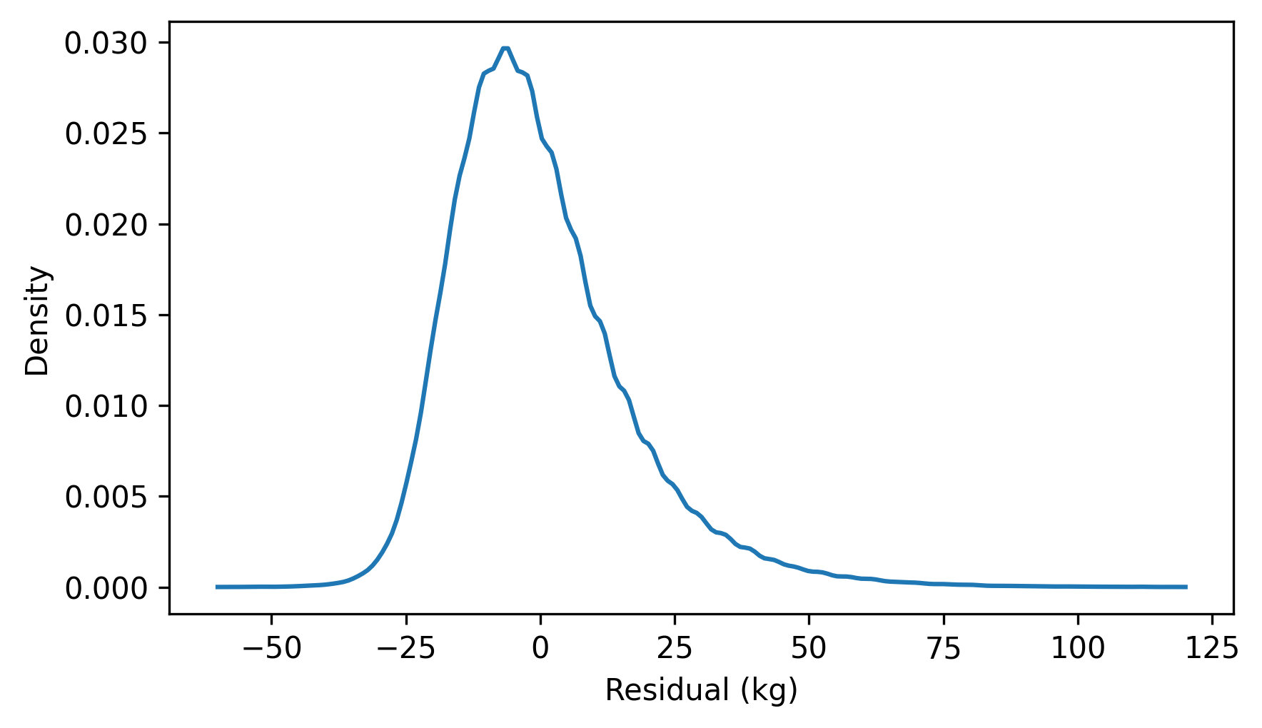
The distribution of the residuals is skewed to the right. By itself, that’s not necessarily a problem, but it suggests that the least squares fit has not characterized the relationship between these variables properly.
If the weights follow a lognormal distribution, their logarithms follow a normal distribution. So let’s see what happens if we fit a line to the logarithms of weight as a function of height.
$ log_weights = np.log10(weights)
result_brfss2 = linregress(heights, log_weights)
result_brfss2.intercept, result_brfss2.slope
(np.float64(0.9930804163932876), np.float64(0.005281454169417777))
Because we transformed one of the variables, the slope and intercept are harder to interpret. But we can use
predict to compute the fitted line.
fit_xs = np.linspace(heights.min(), heights.max())
fit_ys = predict(result_brfss2, fit_xs)
And then plot it along with a scatter plot of the transformed data.
jittered_log_weights = jitter(log_weights, 1.5)
plt.scatter(jittered_heights, jittered_log_weights, alpha=0.01, s=0.1)
plt.plot(fit_xs, fit_ys, color="C1")
decorate(xlabel="Height (cm)", ylabel="Weight (log10 kg)", xlim=xlim)
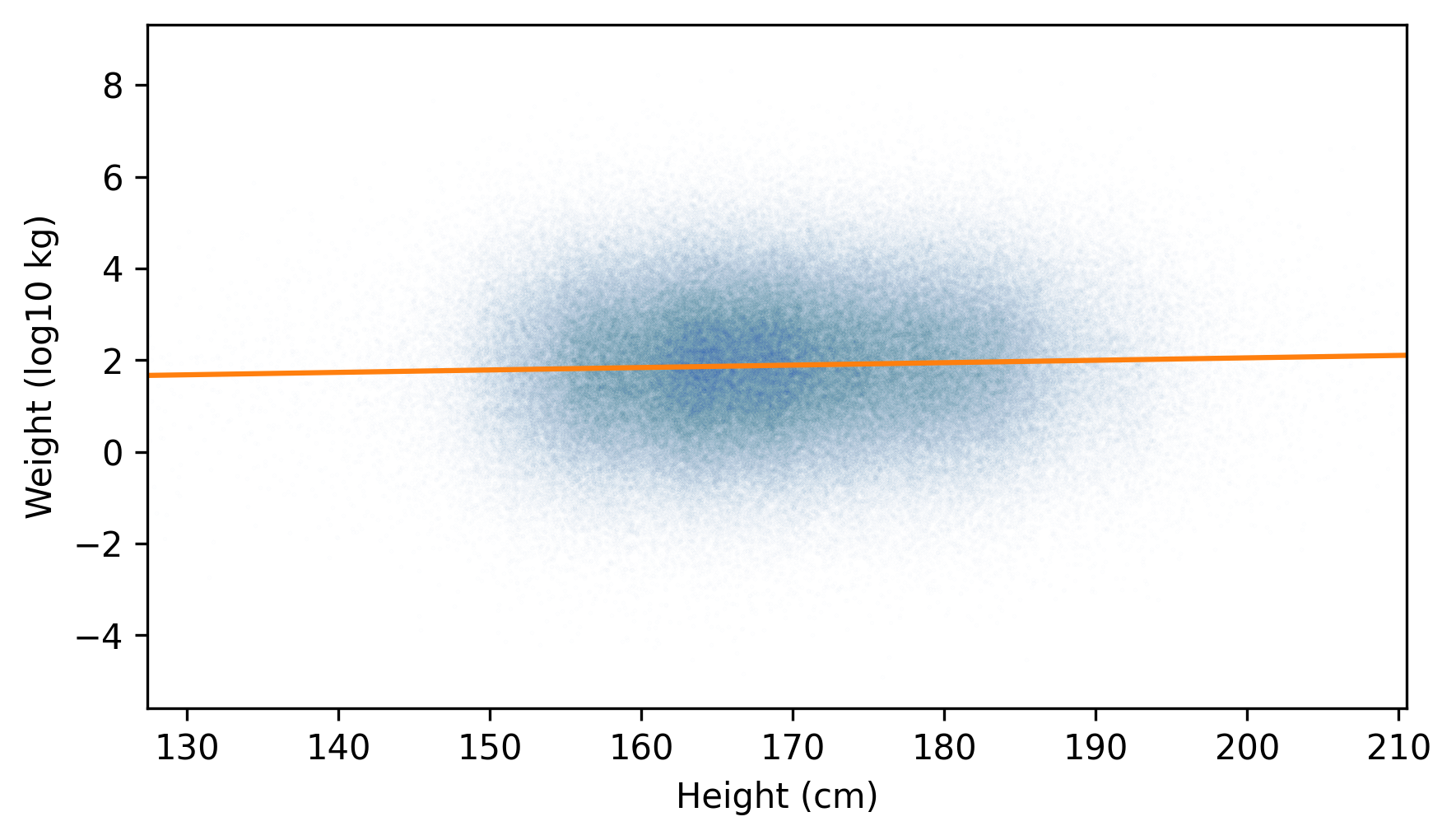
The fitted line passes through the densest part of the plot, and the actual values extend about the same distance above and below the line -- so the distribution of the residuals is roughly symmetric.
residuals = compute_residuals(result_brfss2, heights, log_weights)
pmf_kde = make_pmf(residuals, -0.6, 0.6)
pmf_kde.plot()

decorate(xlabel="Residual (kg)", ylabel="Density")
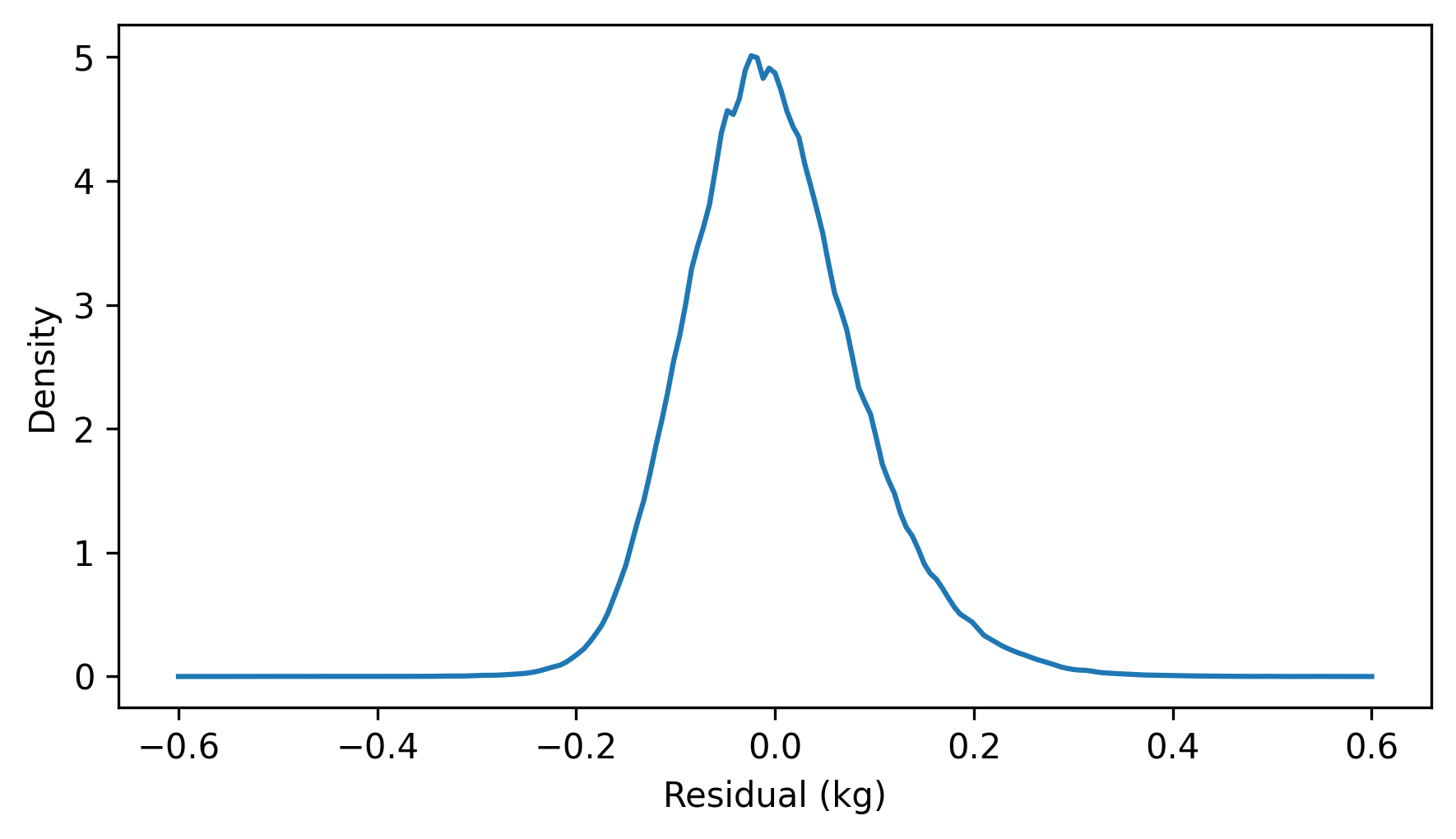
The appearance of the scatter plot and the distribution of the residuals suggest that the relationship of height and log-transformed weight is well described by the fitted line. If we compare the \(r\) values of the two regressions, we see that the correlation of height with log-transformed weights is slightly higher.
$ result_brfss.rvalue, result_brfss2.rvalue
(np.float64(0.5087364789734582), np.float64(0.5317282605983435))
Which means that the \(R^2\) value is slightly higher, too.
$ result_brfss.rvalue**2, result_brfss2.rvalue**2
(np.float64(0.2588128050383119), np.float64(0.28273494311893993))
If we use heights to guess weights, the guesses are a little better if we work with the log-transformed weights.
However, transforming the data makes the parameters of the model harder to interpret -- it can help to invert the transformation before presenting the results. For example, the inverse of a logarithm in base 10 is exponentiation with base 10. Here’s what the fitted line looks like after the inverse transformation, along with the untransformed data.
plt.scatter(jittered_heights, jittered_weights, alpha=0.01, s=0.1)
plt.plot(fit_xs, 10**fit_ys, color="C1")
decorate(xlabel="Height (cm)", ylabel="Weight (kg)", xlim=xlim, ylim=ylim)
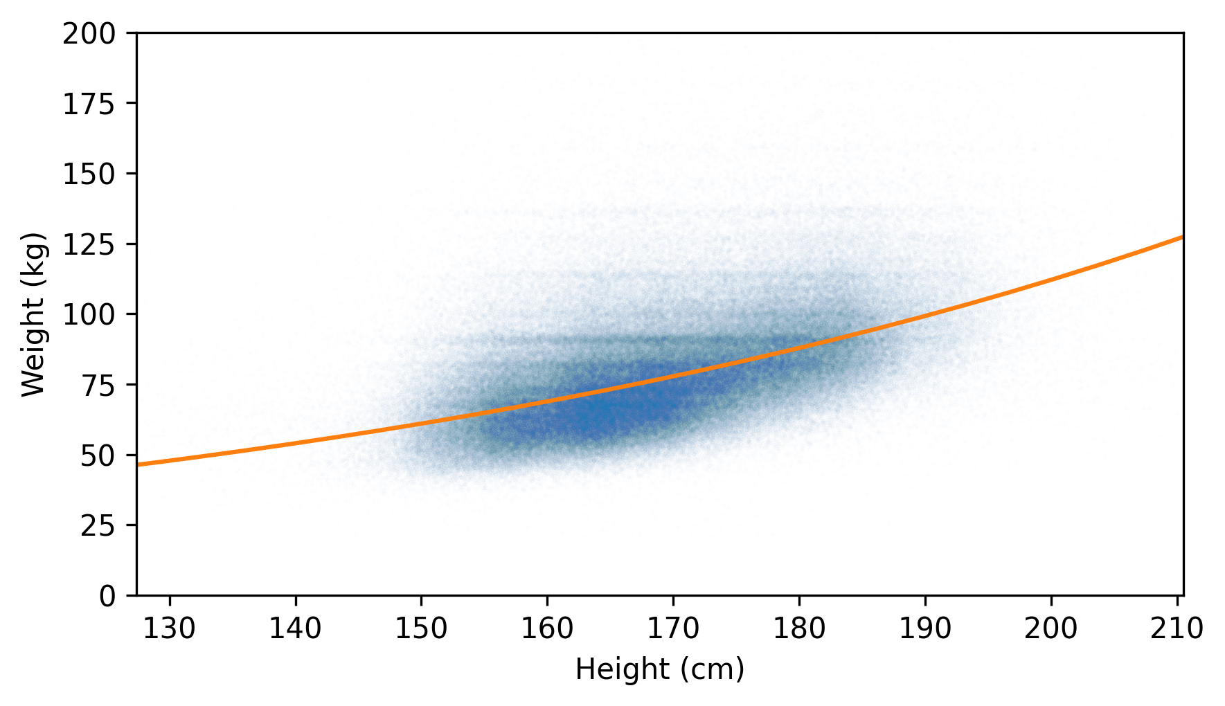
A fitted line that’s straight with respect to the transformed data is curved with respect to the original data.

