Section 7.1 Scatter Plots
If you meet someone who is unusually good at math, do you expect their verbal skills to be better or worse than average? On one hand, you might imagine that people specialize in one area or the other, so someone who excels at one might be less good at the other. On the other hand, you might expect someone who is generally smart to be above average in both areas. Let’s find out which it is.
We’ll use data from the National Longitudinal Survey of Youth 1997 (NLSY97), which "follows the lives of a sample of 8,984 American youth born between 1980-84". The public data set includes the participants’ scores on several standardized tests, including the tests most often used in college admissions, the SAT and ACT. Because test-takers get separate scores for the math and verbal sections, we can use this data to explore the relationship between mathematical and verbal ability.
I used the NLS Investigator to create an excerpt that contains the variables I’ll use for this analysis. With their permission, I can redistribute this excerpt. Instructions for downloading the data are in the notebook for this chapter.
download("https://github.com/AllenDowney/ThinkStats/raw/v3/data/nlsy97-extract.csv.gz")
We can use
read_csv to read the data and replace to replace the special codes for missing data with np.nan.
$ missing_codes = [-1, -2, -3, -4, -5]
nlsy = pd.read_csv("nlsy97-extract.csv.gz").replace(missing_codes, np.nan)
nlsy.shape
(8984, 34)
$ nlsy.head()
   R0000100  R0490200  R0536300  R0536401  R0536402  R1235800  R1318200  \
0         1       NaN         2         9      1981         1       NaN
1         2       NaN         1         7      1982         1     145.0
2         3       NaN         2         9      1983         1      82.0
3         4       NaN         2         2      1981         1       NaN
4         5       NaN         1        10      1982         1       NaN

   R1482600  R3961900  R3989200  ...  R9872200  R9872300  R9872400  S1552700  \
0         4       NaN       NaN  ...     293.0     250.0     333.0       NaN
1         2       NaN       NaN  ...     114.0     230.0     143.0       NaN
2         2       NaN       NaN  ...       NaN       NaN       NaN       NaN
3         2       NaN       NaN  ...     195.0     230.0     216.0       NaN
4         2       NaN       NaN  ...     293.0     230.0     231.0       NaN

   U0008900  U1845500  U3444000  U4949700  Z9083800  Z9083900
0  120000.0       NaN       NaN       NaN      16.0       4.0
1   98928.0  116000.0  188857.0  180000.0      14.0       2.0
2       NaN       NaN       NaN   75000.0      16.0       4.0
3   85000.0   45000.0       NaN       NaN      13.0       2.0
4  210000.0  212000.0       NaN  240000.0      12.0       2.0

[5 rows x 34 columns]
The
DataFrame contains one row for each of the 8984 participants in the survey and one column for each of the 34 variables I selected. The column names don’t mean much by themselves, so let’s replace the ones we’ll use with more interpretable names.
nlsy["sat_verbal"] = nlsy["R9793800"]
nlsy["sat_math"] = nlsy["R9793900"]
Both columns contain a few values less than 200, which is not possible because 200 is the lowest score, so we’ll replace them with
np.nan.
columns = ["sat_verbal", "sat_math"]

for column in columns:
    invalid = nlsy[column] < 200
    nlsy.loc[invalid, column] = np.nan
Next we’ll use
dropna to select only rows where both scores are valid.
$ nlsy_valid = nlsy.dropna(subset=columns).copy()
nlsy_valid.shape
(1398, 36)
SAT scores are standardized so the mean is 500 and the standard deviation is 100. In the NLSY sample, the means and standard deviations are close to these values.
$ sat_verbal = nlsy_valid["sat_verbal"]
sat_verbal.mean(), sat_verbal.std()
(np.float64(501.80972818311875), np.float64(108.36562024213643))
$ sat_math = nlsy_valid["sat_math"]
sat_math.mean(), sat_math.std()
(np.float64(503.0829756795422), np.float64(109.8329973731453))
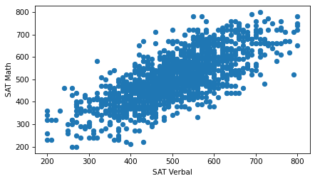
Now, to see whether there is a relationship between these variables, let’s look at a scatter plot.
plt.scatter(sat_verbal, sat_math)

decorate(xlabel="SAT Verbal", ylabel="SAT Math")
Using the default options of the
scatter function, we can see the general shape of the relationship. People who do well on one section of the test tend to do better on the other, too.
However, this version of the figure is overplotted, which means there are a lot of overlapping points, which can create a misleading impression of the relationship. The center, where the density of points is highest, is not as dark as it should be -- by comparison, the extreme values are darker than they should be. Overplotting tends to give too much visual weight to outliers.
We can improve the plot by reducing the size of the markers so they overlap less.
plt.scatter(sat_verbal, sat_math, s=5)

decorate(xlabel="SAT Verbal", ylabel="SAT Math")
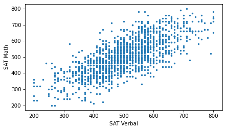
Now we can see that the markers are aligned in rows and columns, because scores are rounded off to the nearest multiple of 10. Some information is lost in the process.
We can’t get that information back, but we can minimize the effect on the scatter plot by jittering the data, which means adding random noise to reverse the effect of rounding off. The following function takes a sequence and jitters it by adding random values from a normal distribution with mean 0 and the given standard deviation. The result is a NumPy array.
def jitter(seq, std=1):
    n = len(seq)
    return np.random.normal(0, std, n) + seq
If we jitter the scores with a standard deviation of 3, the rows and columns are no longer visible in the scatter plot.
sat_verbal_jittered = jitter(sat_verbal, 3)
sat_math_jittered = jitter(sat_math, 3)
plt.scatter(sat_verbal_jittered, sat_math_jittered, s=5)

decorate(xlabel="SAT Verbal", ylabel="SAT Math")
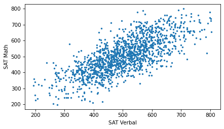
Jittering reduces the visual effect of rounding and makes the shape of the relationship clearer. But in general you should only jitter data for purposes of visualization and avoid using jittered data for analysis.
In this example, even after adjusting the marker size and jittering the data, there is still some overplotting. So let’s try one more thing: we can use the
alpha keyword to make the markers partly transparent.
plt.scatter(sat_verbal_jittered, sat_math_jittered, s=5, alpha=0.2)

decorate(xlabel="SAT Verbal", ylabel="SAT Math")
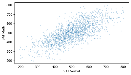
With transparency, overlapping data points look darker, so darkness is proportional to density.
Although scatter plots are a simple and widely-used visualization, they can be hard to get right. In general, it takes some trial and error to adjust marker sizes, transparency, and jittering to find the best visual representation of the relationship between variables.

