Section 7.3 Correlation
When the NLSY participants were in 9th grade, many of them took the mathematics section of the Peabody Individual Achievement Test (PIAT). Let’s give the column that contains the results a more interpretable name.
$ nlsy["piat_math"] = nlsy["R1318200"]
nlsy["piat_math"].describe()
count    6044.000000
mean       93.903706
std        14.631148
min        55.000000
25%        84.000000
50%        92.000000
75%       103.000000
max       145.000000
Name: piat_math, dtype: float64
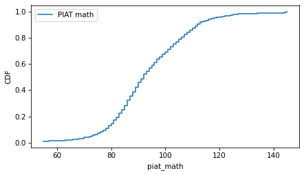
Here’s what the distribution of scores looks like.
from empiricaldist import Cdf

cdf_piat_math = Cdf.from_seq(nlsy["piat_math"], name="PIAT math")
cdf_piat_math.step()
decorate(ylabel="CDF")
Students who do well on the PIAT in 9th grade are likely to do well on the SAT math section in 12th grade. For the NLSY participants who took both tests, the following scatter plot shows the relationship between their scores. It uses the
scatter function in thinkstats, which adjusts the marker size and transparency, and optionally jitters the data.
from thinkstats import scatter

scatter(nlsy, "piat_math", "sat_math")

decorate(xlabel="PIAT Math", ylabel="SAT Math")
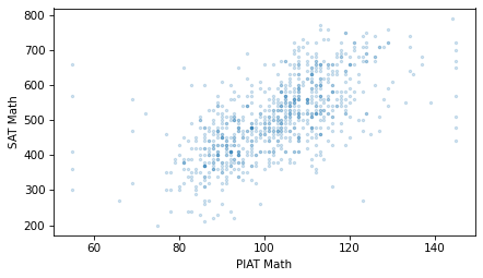
As expected, students who do well on the PIAT are likely to do well on the SAT math. And if math and verbal ability are related, we expect them do well on the SAT verbal section, too. The following figure shows the relationship between the PIAT and SAT verbal scores.
scatter(nlsy, "piat_math", "sat_verbal")

decorate(xlabel="PIAT Math", ylabel="SAT Verbal")
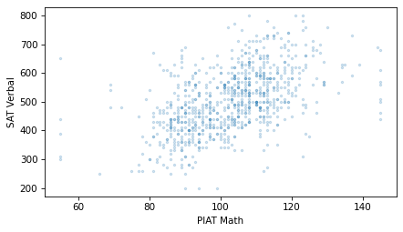
Students with higher PIAT scores also have higher SAT verbal scores, on average.
Comparing the scatter plots, the points in the first figure might be more compact, and the points in the second figure more dispersed. If so, that means that the PIAT math scores predict SAT math scores more accurately than they predict SAT verbal scores -- and it makes sense if they do.
To quantify the strength of these relationships, we can use the Pearson correlation coefficient, often just called "correlation". To understand correlation, let’s start with standardization.
To standardize a variable, we subtract off the mean and divide through by the standard deviation, as in this function.
def standardize(xs):
    """Standardizes a sequence of numbers.

    xs: sequence of numbers

    returns: NumPy array
    """
    return (xs - np.mean(xs)) / np.std(xs)
valid = nlsy.dropna(subset=["piat_math", "sat_math"])
piat_math = valid["piat_math"]
sat_math = valid["sat_math"]
And standardize the PIAT math scores.
$ piat_math_standard = standardize(piat_math)
np.mean(piat_math_standard), np.std(piat_math_standard)
(np.float64(-2.4321756236287047e-16), np.float64(1.0))
The results are standard scores, also called "z-scores". Because of the way the standard scores are calculated, the mean is close to 0 and the standard deviation is close to 1.
Let’s also standardize the SAT math scores.
$ sat_math_standard = standardize(sat_math)
np.mean(sat_math_standard), np.std(sat_math_standard)
(np.float64(-1.737268302591932e-16), np.float64(0.9999999999999998))
The following figure shows sequences of these scores for the first 100 participants.
Calling
subplot with the arguments 2, 1, 1 tells Matplotlib to create multiple plots, arranged in two rows and one column, and initializes the first plot. Calling it again with the arguments 2, 1, 2 initializes the second plot. axhline draws a horizontal line that spans the width of the axes.
plt.subplot(2, 1, 1)
plt.axhline(0, color="gray", lw=1, alpha=0.5)
plt.plot(piat_math_standard.values[:100], label="PIAT math")
decorate(ylabel="z-score", xticks=[])

plt.subplot(2, 1, 2)
plt.axhline(0, color="gray", lw=1, alpha=0.5)
plt.plot(sat_math_standard.values[:100], label="SAT math", color="C1")
decorate(ylabel="z-score", xticks=[])
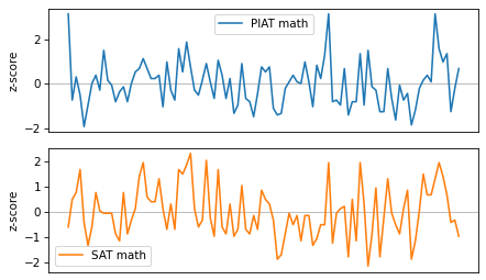
These variables are clearly related: when one is above the mean, the other is likely to be above the mean, too. To quantify the strength of this relationship, we’ll multiply the standard scores element-wise and compute the average of the products.
When both scores are positive, their product is positive, so it tends to increase the average product. And when both scores are negative, their product is positive, so it also tends to increase the average product. When the scores have opposite signs, the product is negative, so it decreases the average product. As a result, the average product measures the similarity between the sequences.
$ np.mean(piat_math_standard * sat_math_standard)
np.float64(0.639735816517885)
The result, which is about 0.64, is the correlation coefficient. Here’s one way to interpret it: if someone’s PIAT math score is 1 standard deviation above the mean, we expect their SAT math score to be 0.64 standard deviations above the mean, on average.
The result is the same if we multiply the elements in the other order.
$ np.mean(sat_math_standard * piat_math_standard)
np.float64(0.639735816517885)
So the correlation coefficient is symmetric: if someone’s SAT math score is 1 standard deviation above the mean, we expect their PIAT math score to be 0.64 standard deviations above the mean, on average.
Correlation is a commonly-used statistic, so NumPy provides a function that computes it.
$ np.corrcoef(piat_math, sat_math)
array([[1.        , 0.63973582],
       [0.63973582, 1.        ]])
The result is a correlation matrix, with one row and one column for each variable. The value in the upper left is the correlation of
piat_math with itself. The value in the lower right is the correlation of sat_math with itself. The correlation of any variable with itself is 1, which indicates perfect correlation.
The values in the upper right and lower left are the correlation of
piat_math with sat_math and the correlation of sat_math with piat_math, which are necessarily equal.
thinkstats provides a corrcoef function that takes a DataFrame and two column names, selects the rows where both columns are valid, and computes their correlation.
$ from thinkstats import corrcoef

corrcoef(nlsy, "piat_math", "sat_math")
np.float64(0.6397358165178849)
$ corrcoef(nlsy, "piat_math", "sat_verbal")
np.float64(0.509413914696731)
The correlation is about 0.51, so if someone’s PIAT math score is one standard deviation above the mean, we expect their SAT verbal score to be 0.51 standard deviations above the mean, on average.
As we might expect, PIAT math scores predict SAT math scores better than they predict SAT verbal scores.

