Section 7.2 Decile Plots
Scatter plots provide a general impression of the relationship between variables, but there are other visualizations that provide more insight into the nature of the relationship. One of them is a decile plot.
To generate a decile plot, we’ll sort the respondents by verbal score and divide them into 10 groups, called deciles. We can use the
qcut method to compute the deciles.
$ deciles = pd.qcut(nlsy_valid["sat_verbal"], 10, labels=False) + 1
deciles.value_counts().sort_index()
sat_verbal
1     142
2     150
3     139
4     140
5     159
6     130
7     148
8     121
9     138
10    131
Name: count, dtype: int64
The number of respondents in each decile is roughly equal.
$ df_groupby = nlsy_valid.groupby(deciles)
df_groupby
<pandas.core.groupby.generic.DataFrameGroupBy object at 0x7fa0adfd49d0>
The result is a
DataFrameGroupBy object that represents the groups. We can select the sat_math column from it.
$ series_groupby = df_groupby["sat_math"]
series_groupby
<pandas.core.groupby.generic.SeriesGroupBy object at 0x7fa0b01af7d0>
The result is a
SeriesGroupBy object that represents the math scores in each decile. We can use the quantile function to compute the 10th, 50th, and 90th percentiles in each group.
low = series_groupby.quantile(0.1)
median = series_groupby.quantile(0.5)
high = series_groupby.quantile(0.9)
A decile plot shows these percentiles for each decile group. In the following figure, the line shows the median and the shaded region shows the area between the 10th and 90th percentiles.
xs = median.index
plt.fill_between(xs, low, high, alpha=0.2)
plt.plot(xs, median, label="median")

decorate(xlabel="SAT Verbal Decile", ylabel="SAT Math")
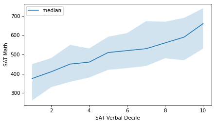
As an alternative, we can compute the median verbal score in each group and plot those values on the x-axis, rather than the decile numbers.
xs = df_groupby["sat_verbal"].median()

plt.fill_between(xs, low, high, alpha=0.2)
plt.plot(xs, median, color="C0", label="median")

decorate(xlabel="SAT Verbal", ylabel="SAT Math")
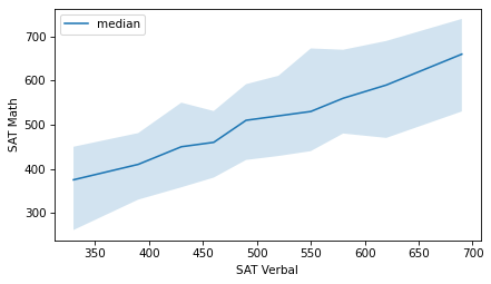
It looks like the relationship between these variables is linear -- that is, each increase in the median verbal scores corresponds to a roughly equal increase in median math scores.
More generally, we could divide the respondents into any number of groups, not necessarily 10, and we could compute other summary statistics in each group, not just these percentiles.

